Metadata
Sector
- Engineering
Scope
- UI/UX Design
- Development
Technologies
Vercel
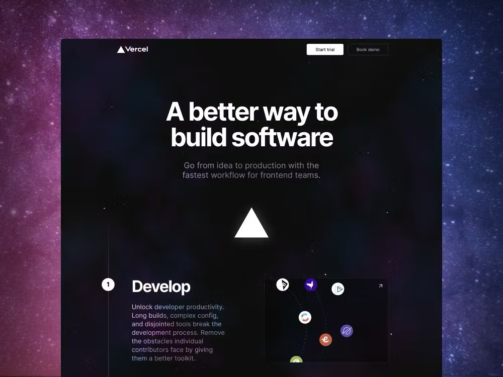
Vercel is shaping the future of the web with developers at the forefront. As a longtime partner with Vercel, Monogram has had firsthand experience with how Vercel is building the future of the web. Vercel introduced the idea of Developer Experience to the modern web, which Monogram has taken full advantage of.
Vercel’s marketing team came to Monogram looking for help showcasing its seamless workflow with a mini-site. As partners, Vercel had seen what the Monogram team could accomplish, and knew Monogram could build an exemplary digital experience.

Iteration, Iteration, Iteration
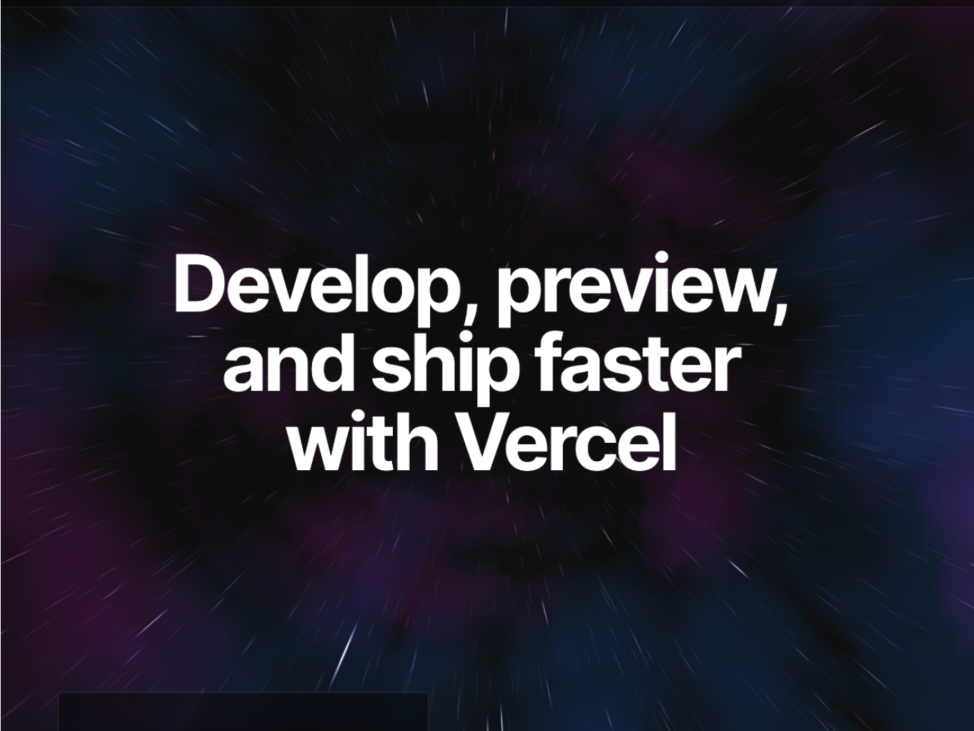
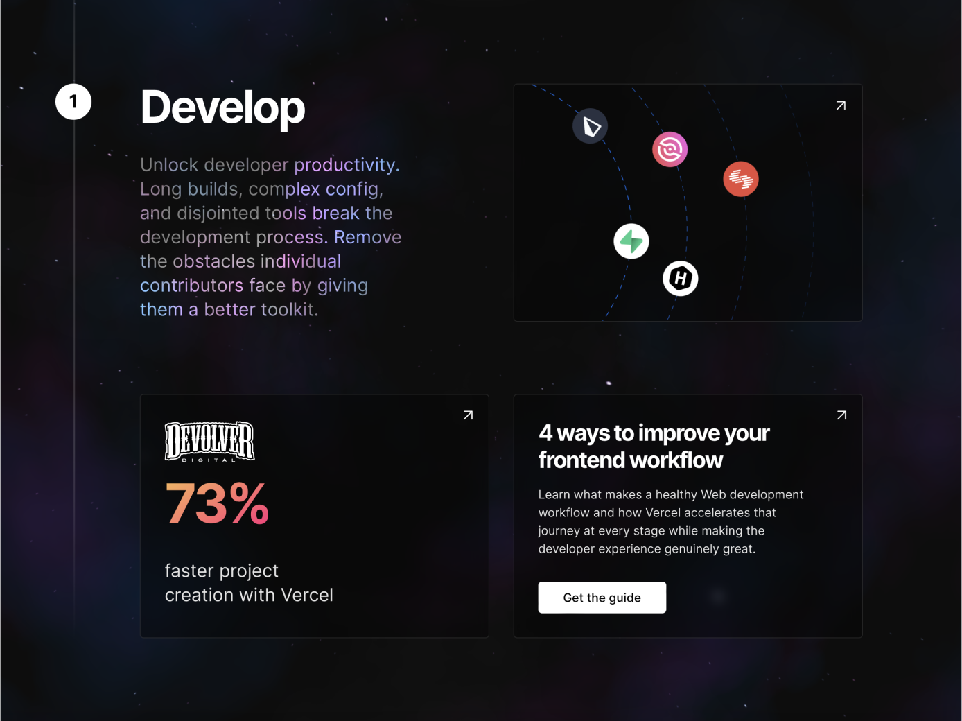
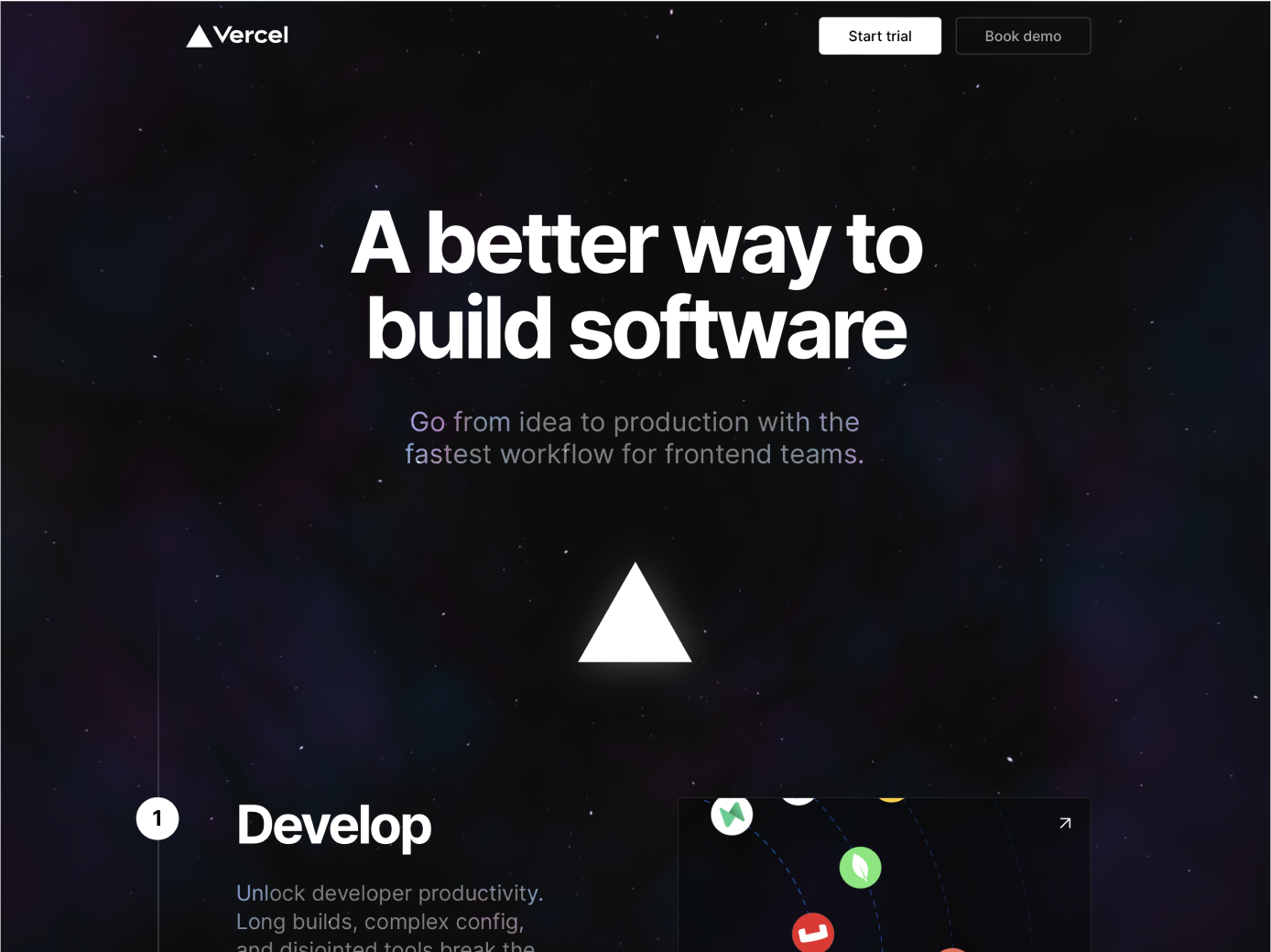
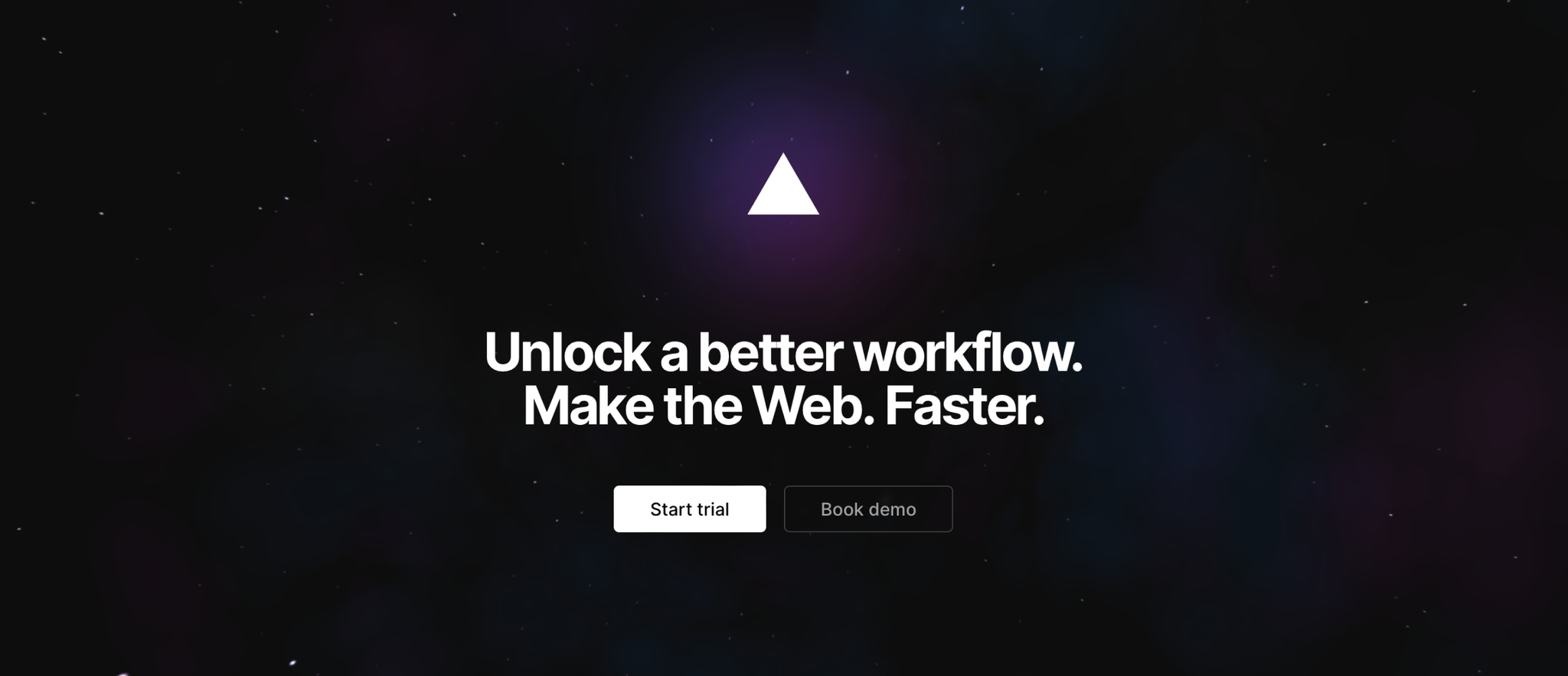
Working closely with Vercel’s engineering and marketing team, Monogram went through multiple design iterations to deliver a high-quality site to users. From abstract art to mysterious moving gradients, we designed and built a fully working demo for each iteration. After many prototypes and proof of concepts, Monogram and Vercel eventually settled on a moving starfield with nebula clouds zooming past as users scroll down.
Thorough, Thoughtful Development
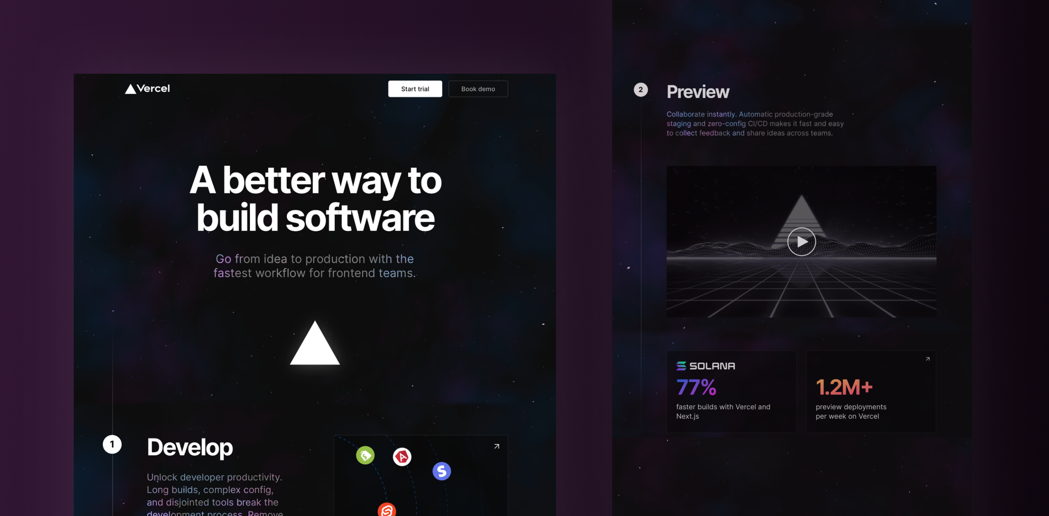
Simulating an entire galaxy in the browser — and making it loading quickly — isn’t easy. But we pulled it off by using a low-level language that runs on the user’s GPU. Additionally, to ensure a great experience for all users, Monogram implemented accessibility features. If a user prefers Reduced Motion, the starfield and text do not animate. Users who prefer increased contrast are shown a site with deeper blacks and brighter highlights.
Light Speed Ahead
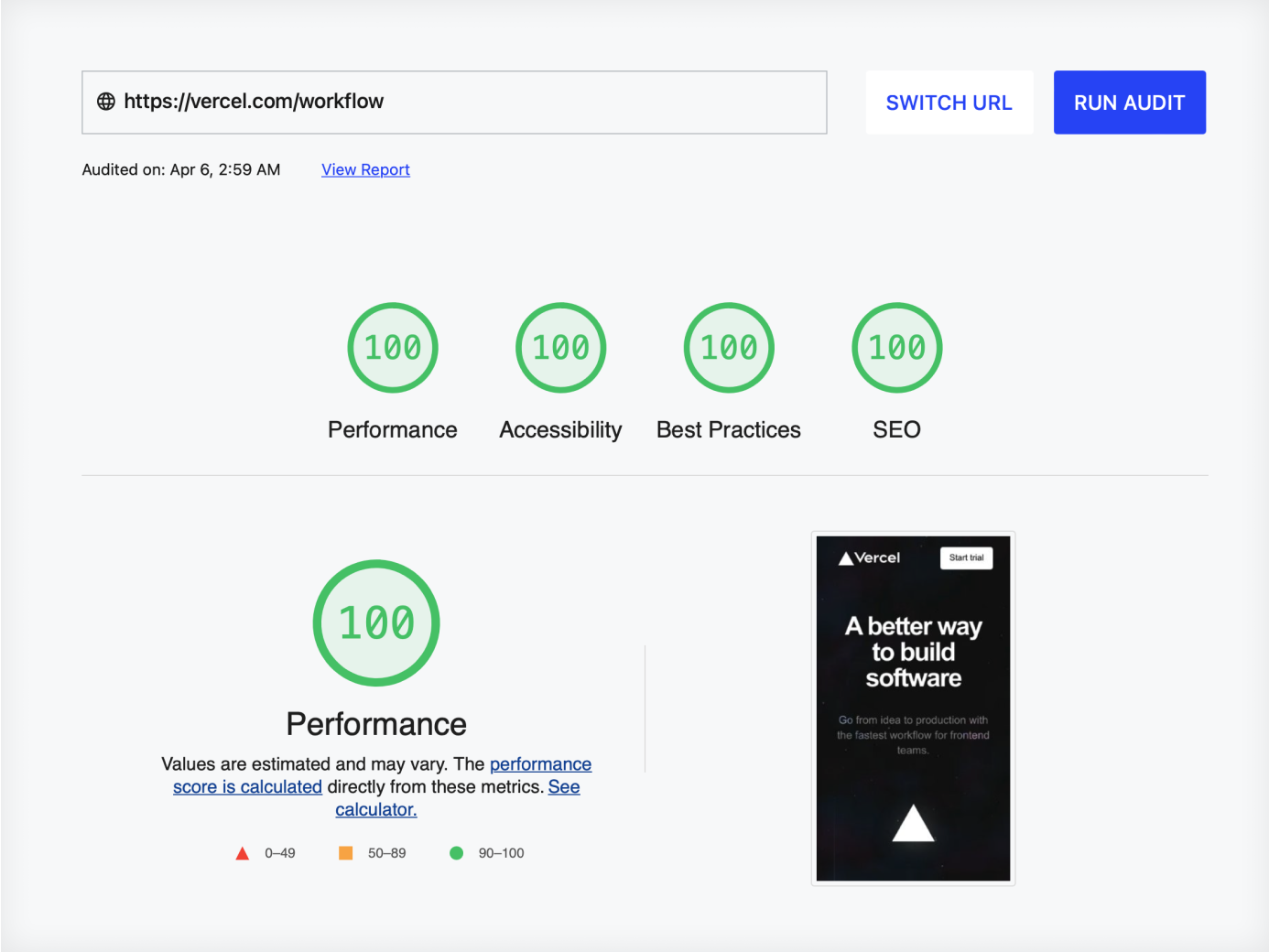
Developing a site with this many moving parts often sacrifices load time on the page, which can significantly increase bounce rates and lower the number of leads generated. Due to our expertise in Jamstack, however, Vercel’s workflow site is incredibly fast. Then, we optimized fonts and embeds to ensure fast performance while still supporting every feature and allowing for analytics and issue tracking. The result was a perfect PageSpeed Insights score that made no sacrifices to the user’s experience.
Final Results ✨
Simulating an entire galaxy in the browser — and making it loading quickly — isn’t easy. But we pulled it off by using a low-level language that runs on the user’s GPU. Additionally, to ensure a great experience for all users, Monogram implemented accessibility features. If a user prefers Reduced Motion, the starfield and text do not animate. Users who prefer increased contrast are shown a site with deeper blacks and brighter highlights.
Delightful design, exceptional engineering. Monogram’s way of collaborating took our project beyond our hopes. They have a deep understanding of the Web platform and it shows. I will hire them again and again and again!
Hank TaylorVP of Marketing & RevOps at Vercel
