Metadata
Sector
- AI
Scope
- Branding
- UI/UX Design
- Development
Technologies
- Vercel
- Next.js
- Tailwind CSS
- Three.js
- WebGL
- GitHub
Hypermode
Monogram undertook the creative and technical challenge of bringing hypermode.com to life. This project was envisioned as a landing page from space, designed to captivate users with its celestial aesthetics while guiding them through a fun and interactive journey to assess their Hypermode readiness. The goal was to merge cutting-edge web technologies with imaginative design to create an unforgettable user experience, resulting in a fun and engaging website.
Intergalactic Design
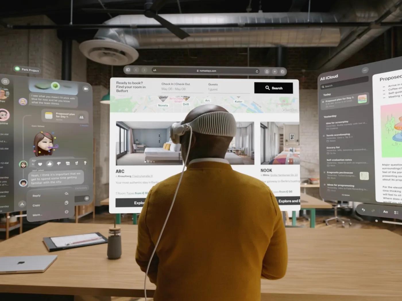
To encapsulate the vastness and wonder of the cosmos within the confines of a web page, a palette of deep space hues were mocked up and the website’s flow was carefully crafted to transport users through space. Additionally, floating elements create a sense of weightlessness as if the UI elements are suspended in the cosmic expanse, similar to the experience offered by the Apple Vision Pro. This coupled with the thematic approach makes the exploration of the site a delightful experience.
The Portal
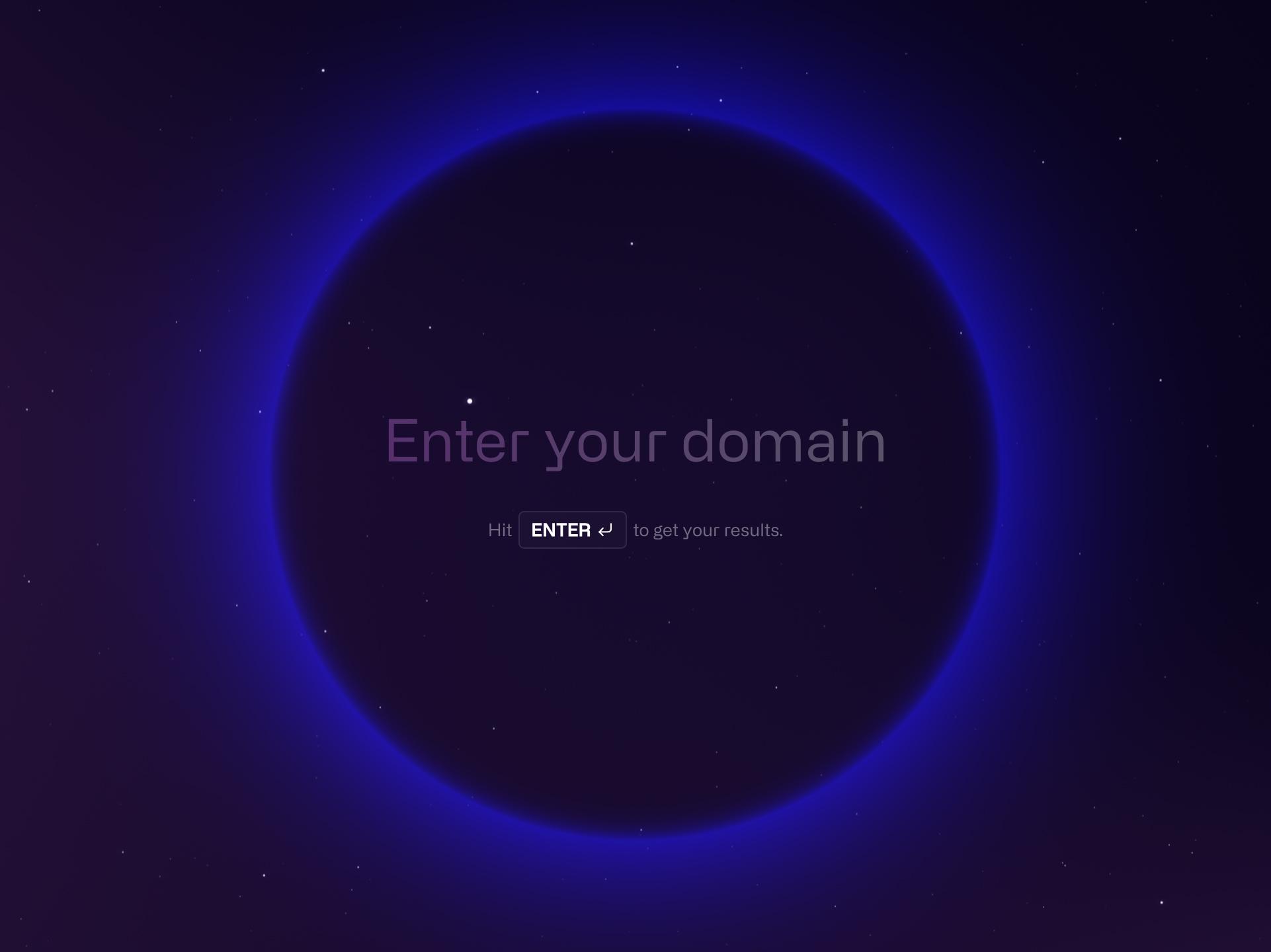
Central to our design concept is “The Portal,” a WebGL-powered sphere that forms the dynamic backdrop of the entire website, complemented by 3D-rendered stars that twinkle and drift across the screen and follow the cursor. This immersive background is not just a static image but a living, moving entity that responds to user interaction, creating a sense of depth and vastness.
Personalized OG Image
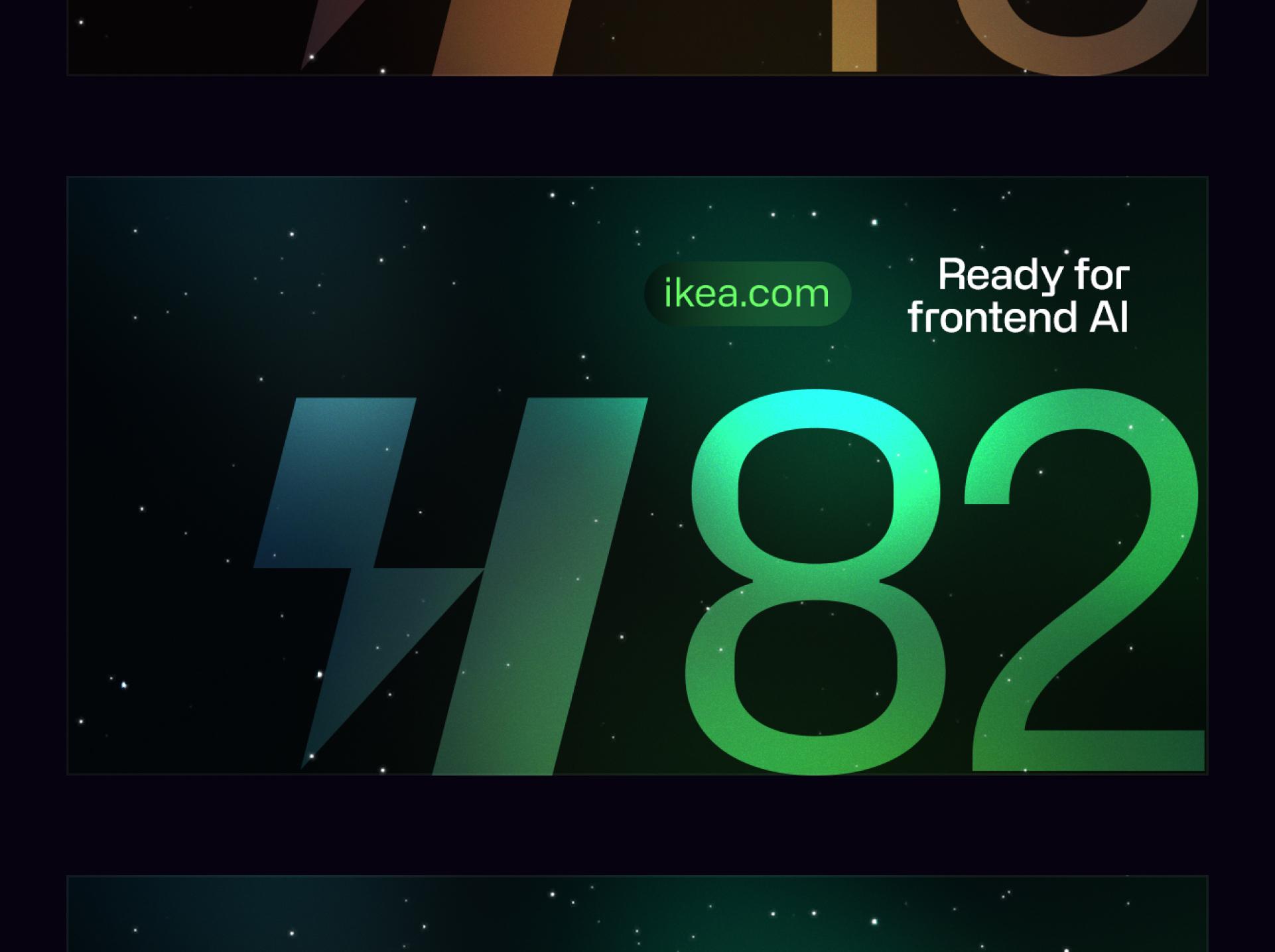
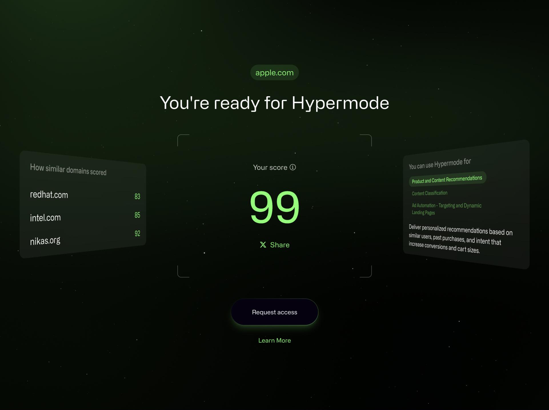
Made possible by the innovative opengraph-image file convention introduced in Next.js 13, dynamic OG images were created to share the score results on social media platforms. These images dynamically display the user's Hypermode readiness score, submitted domain, theming that aligns with the score, and a custom message indicating the user's readiness for Hypermode. This functionality allows for a personalized representation of their assessment results when shared online, utilizing the latest web technologies to promote the Hypermode platform through visually rich, shareable content.
Beyond the Numbers
Rather than simply presenting a static score, the page employs a dynamic theme applied based on the user's Hypermode readiness score, transforming raw data into an immersive, interactive visual narrative. This detail combined with the use of CSS perspective animations to display tilted cards containing similar domains along with potential use cases for Hypermode, creates an engaging experience that invites users to request access to Hypermode and explore ways to improve their score.
The Stars
The space scene (or starfield as it's sometimes called) moves slowly towards the camera, and the number of particles (stars) generated is a fixed amount for performance.
The Stars part 2
While the camera moves through the stars though, you'll eventually run out of visible particles. To solve this problem we're using an “infinite grid” technique where there are 3 blocks of stars/particles the camera is moving through.
When the first block passes out of the camera's view, it's then moved to the back of the stack (also outside of the camera's visible distance).
Which in-turn gives the effect of an infinite starfield, that seemingly goes on forever, but is really just the same 3 blocks of stars repeated over time.
The Clouds
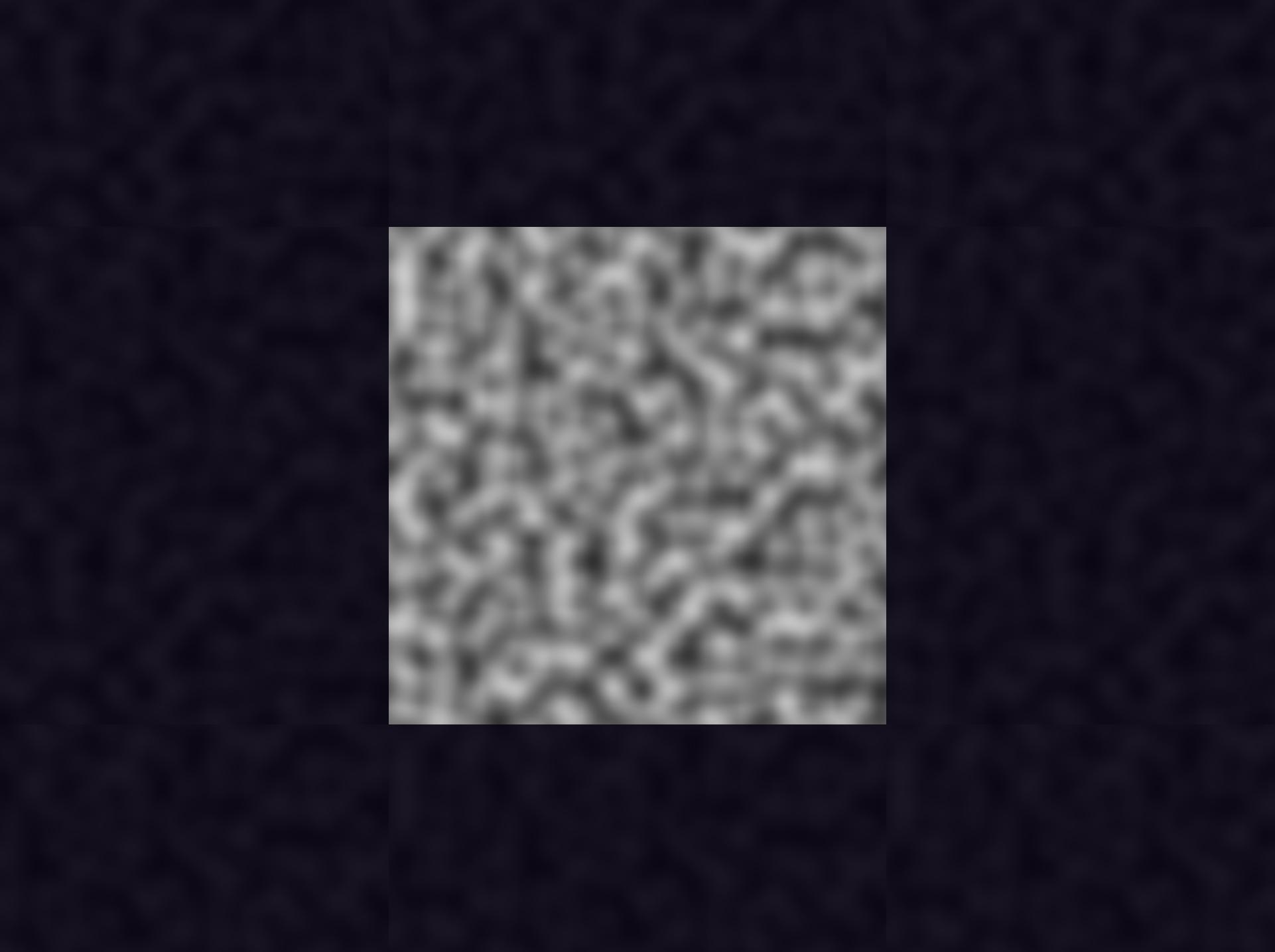
As an additional layer to the 2D composite above, a purple nebula-like glow is blended additively, creating more movement and depth to the scene, though all 2D.
Technically, the clouds/nebula effect is really just tiling Perlin noise, moving from top-right to bottom-left. If you watch it long enough you can see the repeated pattern.
Finally, dithering is applied to the output colors to keep the gradients looking as smooth as possible. Without dithering, you can sometimes see color banding between the subtle changes of gradients.
React Integration
Here we're using a custom MVC design pattern for vanilla three.js, where each of the methods can be called from the React frontend via a global store.
'use client'

import { useEffect, useRef } from 'react'

import store from '@lib/store'

import ThreeCanvas from '../canvas/ThreeCanvas'

export default function Canvas() {
	const canvasRef = useRef(null)

	useEffect(() => {
		store.canvas = new ThreeCanvas(canvasRef.current!)

		const loadCanvas = async () => {
			if (store.canvas) {
				await store.canvas.ready()
				store.canvas.animateIn()
			}
		}

		loadCanvas()

		return () => {
			if (store.canvas) {
				store.canvas = store.canvas.destroy()
			}
		}
	}, [canvasRef])

	return (
		<div className="overflow-hidden fixed top-0 left-0 w-screen h-screen pointer-events-none">
			<canvas ref={canvasRef} />
		</div>
	)
}The Portal
With the sphere (or “portal”) at the center of the scene, and the camera that also rotates around the center of the scene (an orbit camera), we can get away with the sphere being 2D, as it will always look the same from every angle. So in this case the effect is actually 2D, rendered over-top of the space scene as a 2D composite.