Metadata
Sector
- Food
- Retail
Scope
- UI/UX Design
- Development
Hy-Vee
Hy-Vee, a prominent Midwest supermarket chain, partnered with Monogram to design and develop not one, but three impactful websites: Hy-Vee Red Media, Hy-Vee Opportunity Summit, and Hy-Vee KidsFit.
Our collaboration with Hy-Vee went beyond mere website development; it was a dedicated effort to craft digital experiences that deeply resonate with their audience. The overarching goal was to infuse creativity, functionality, and a user-centric approach into each project.
Through a successful partnership, Monogram's expertise in design and development brought these projects to life, ensuring their continued success.
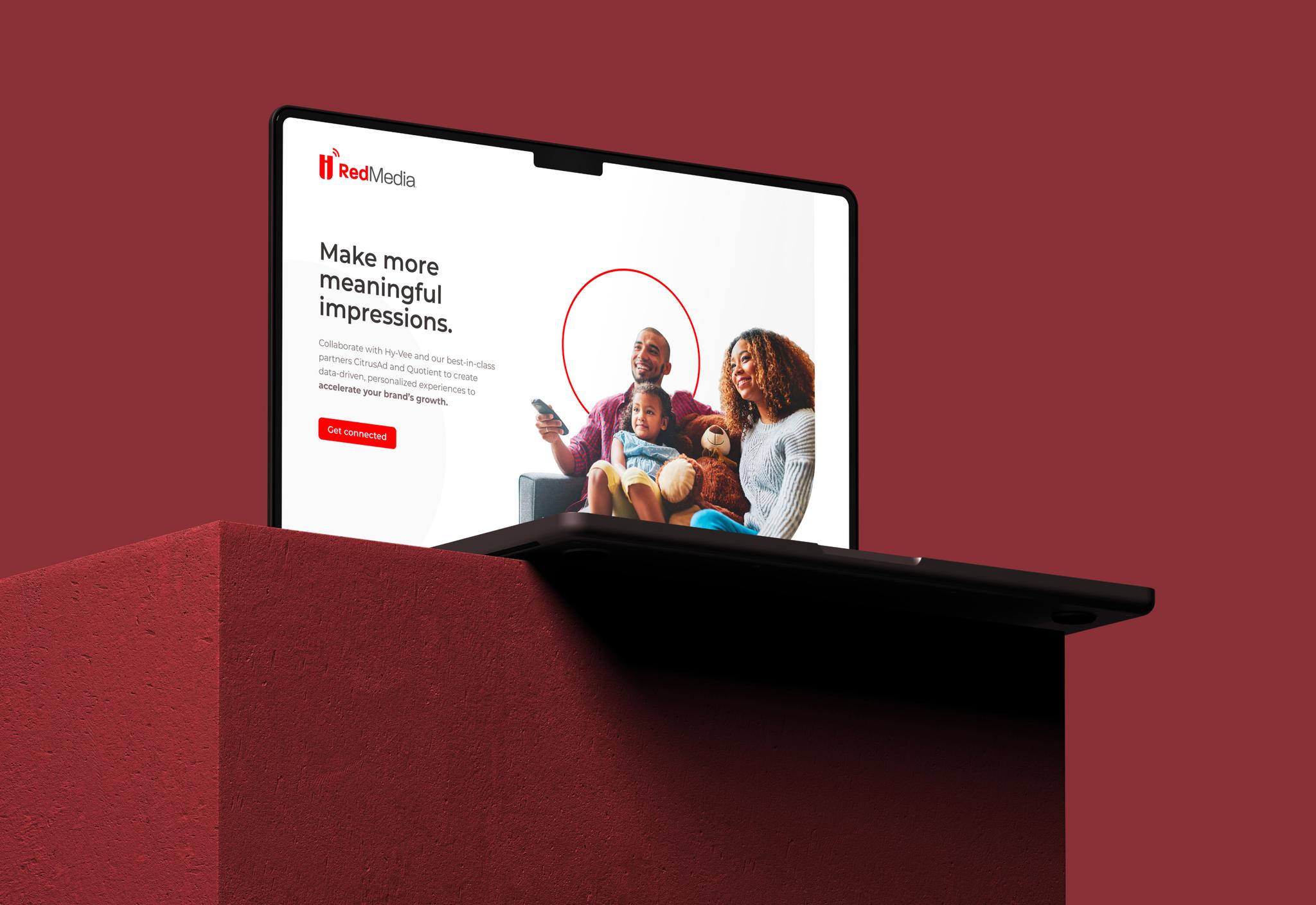
RedMedia
We utilized vibrant, abstract imagery to build an environment, and responsive content to ensure visitors find what they need for their platform of choice. The resulting website is beautiful and lightning-fast.
Designed for Success
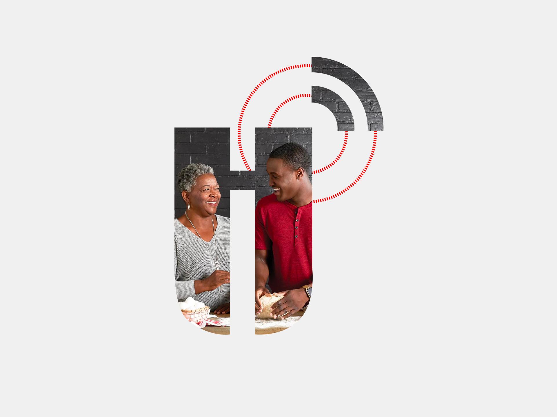
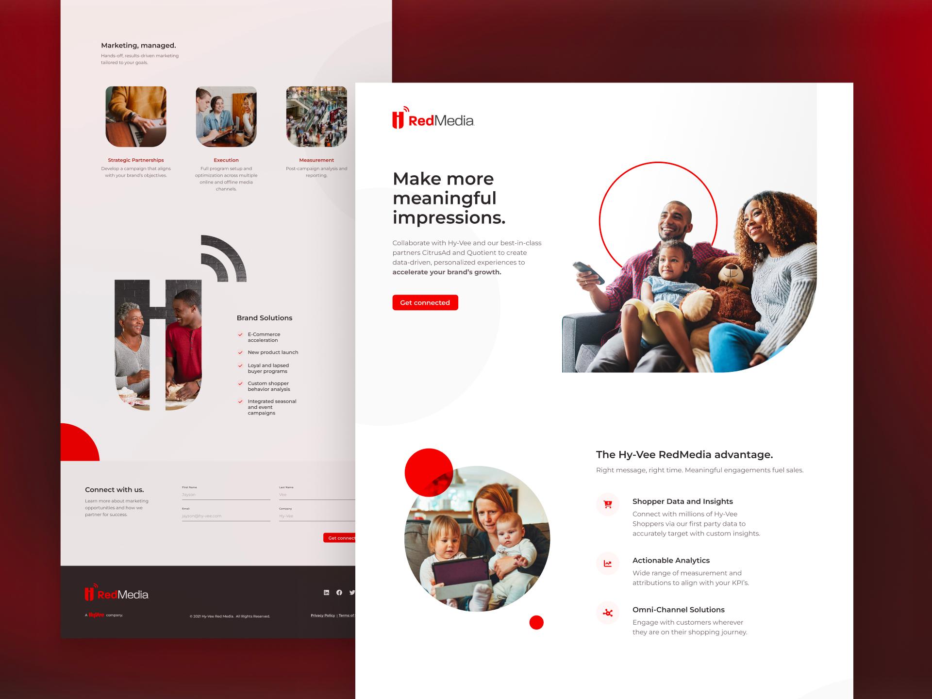
During the design phase, Monogram diligently went through several iterations, fine-tuning each detail to ensure a seamless integration of Hy-Vee's branding into the RedMedia site. The result is a visually captivating website that strikes the perfect balance between familiarity and modernity.
The Development Journey
While building the RedMedia website, Monogram placed performance at the forefront, prioritizing speed and functionality. Employing cutting-edge technologies like Tailwind CSS and Next.js, the result is a site that not only ensures swift loading times but also delivers impeccable functionality
OpportUNITY Summit
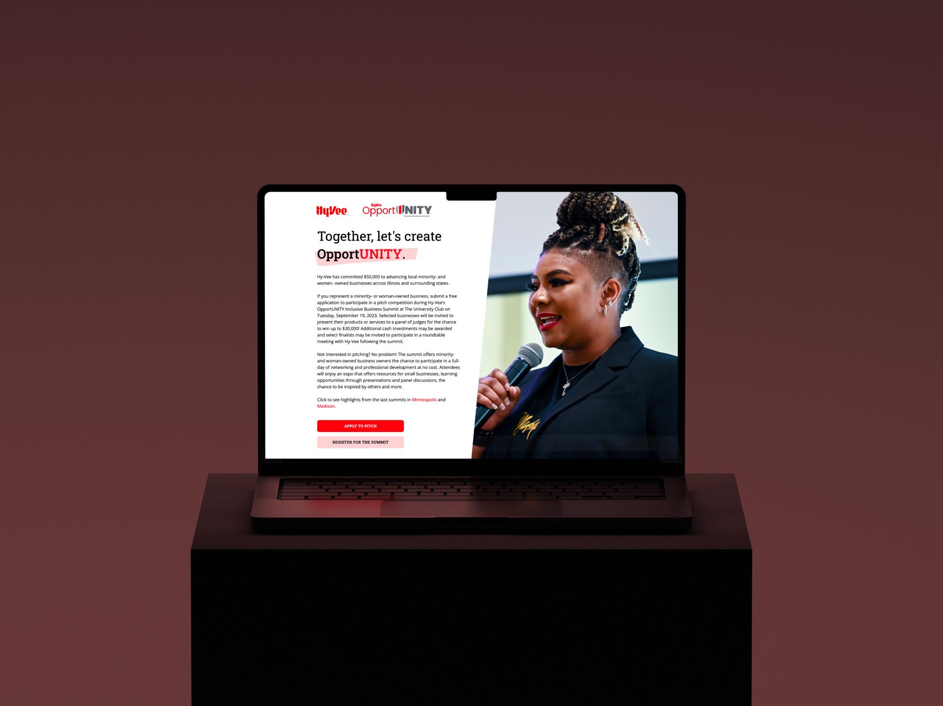
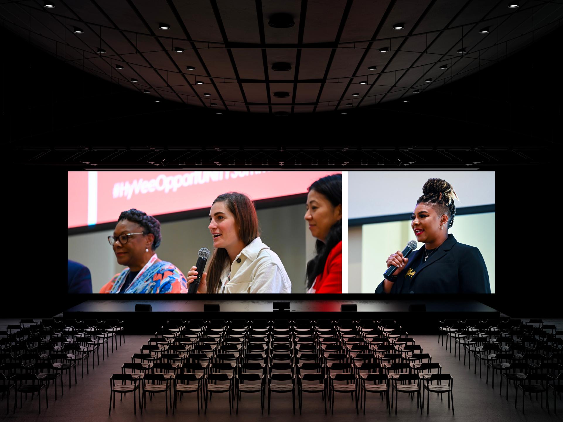
Hy-Vee's OpportUNITY Summit is multiple events across the Midwest, dedicated to supporting local minority and women-owned businesses. It features a Pitch competition with cash prizes, networking opportunities with Hy-Vee, and a free full-day of networking and professional development. This initiative highlights Hy-Vee's commitment to empowering and giving back to the community. Monogram has closely collaborated with Hy-Vee, ensuring the success of four OpportUNITY Summits held in Madison, Minneapolis, Kansas City, and Cedar Rapids, empowering numerous business owners throughout the journey.
The Artistry Behind OpportUNITY
In bringing the OpportUNITY Summit to life, Monogram placed a premium on engaging local business owners while staying faithful to the essence of the Hy-Vee brand. The design is not just visually appealing; it's a seamless blend of aesthetics and functionality, providing easy access to vital information for a user-friendly experience.
Architecting OpportUNITY
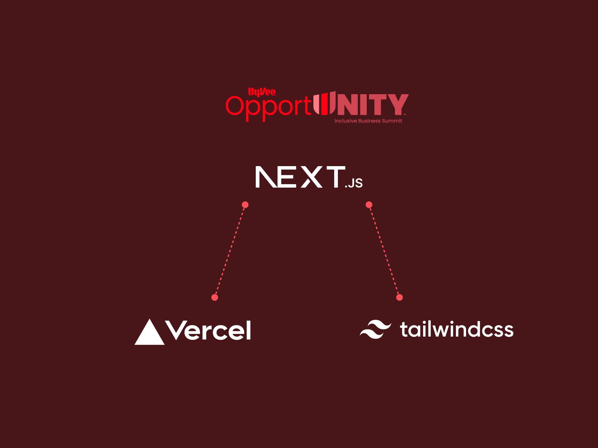
Monogram developed a beautiful website for the OpportUNITY Summit, providing reliable handling of applications and registrations while ensuring synchronization between Hy-Vee's team and attendees. The site's high reusability and easy content changes offer flexibility and fast updates as the Summit moves across the Midwest and as new requirements arise.
KidsFit
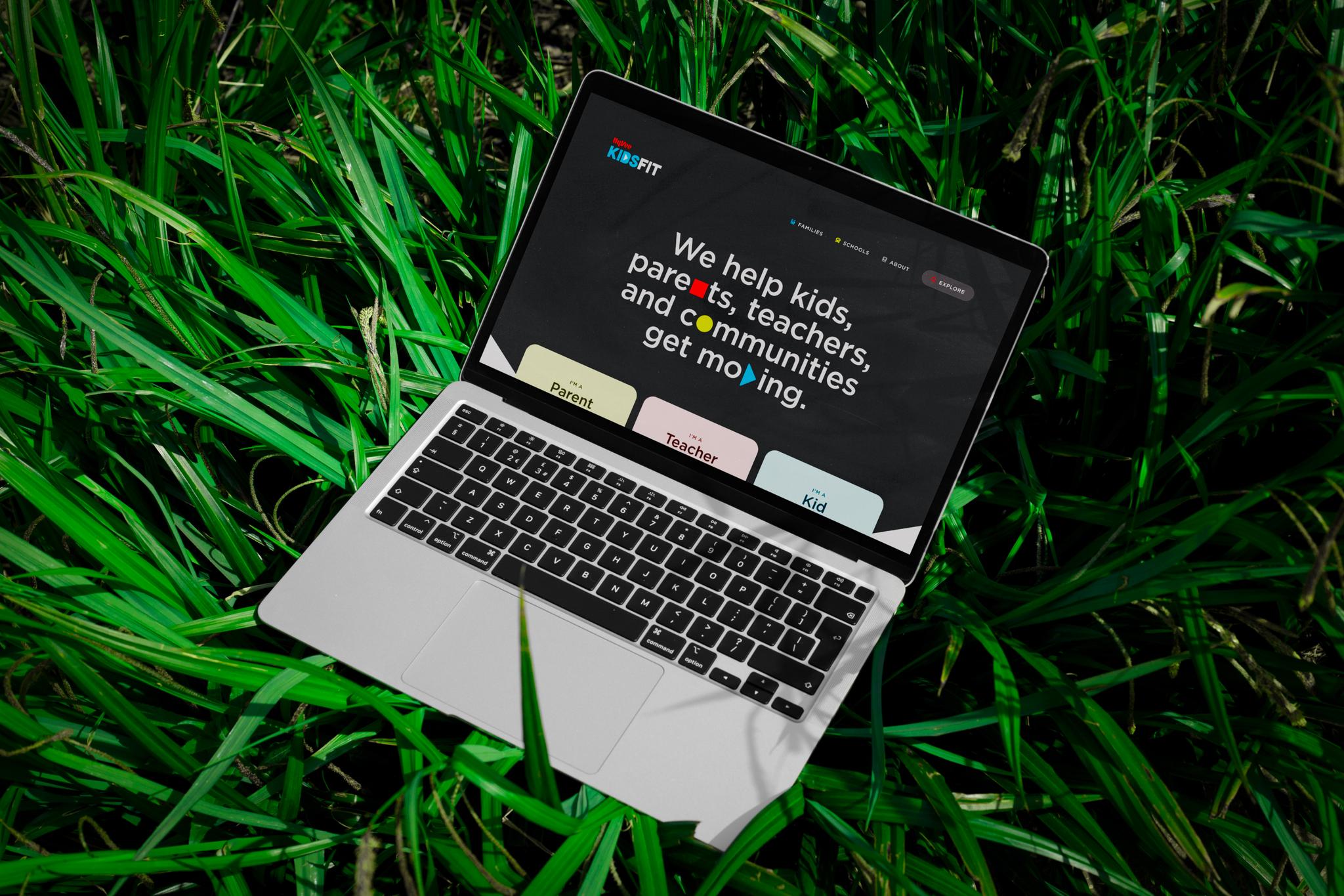
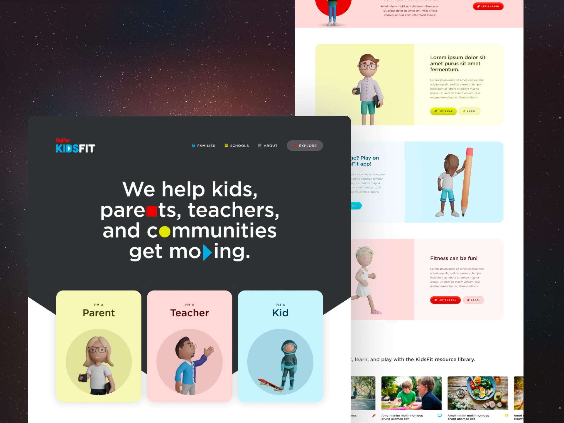
Hy-Vee KidsFit is an innovative health and wellness program designed to educate and encourage children and families to make healthy choices and lead active lifestyles. Hy-Vee recognized the evolving needs of their audience, thus the KidsFit website underwent a strategic redesign and redevelopment to enhance user experience, provide valuable resources, and encourage lasting healthy habits.
Harmonizing Innovation and Familiarity
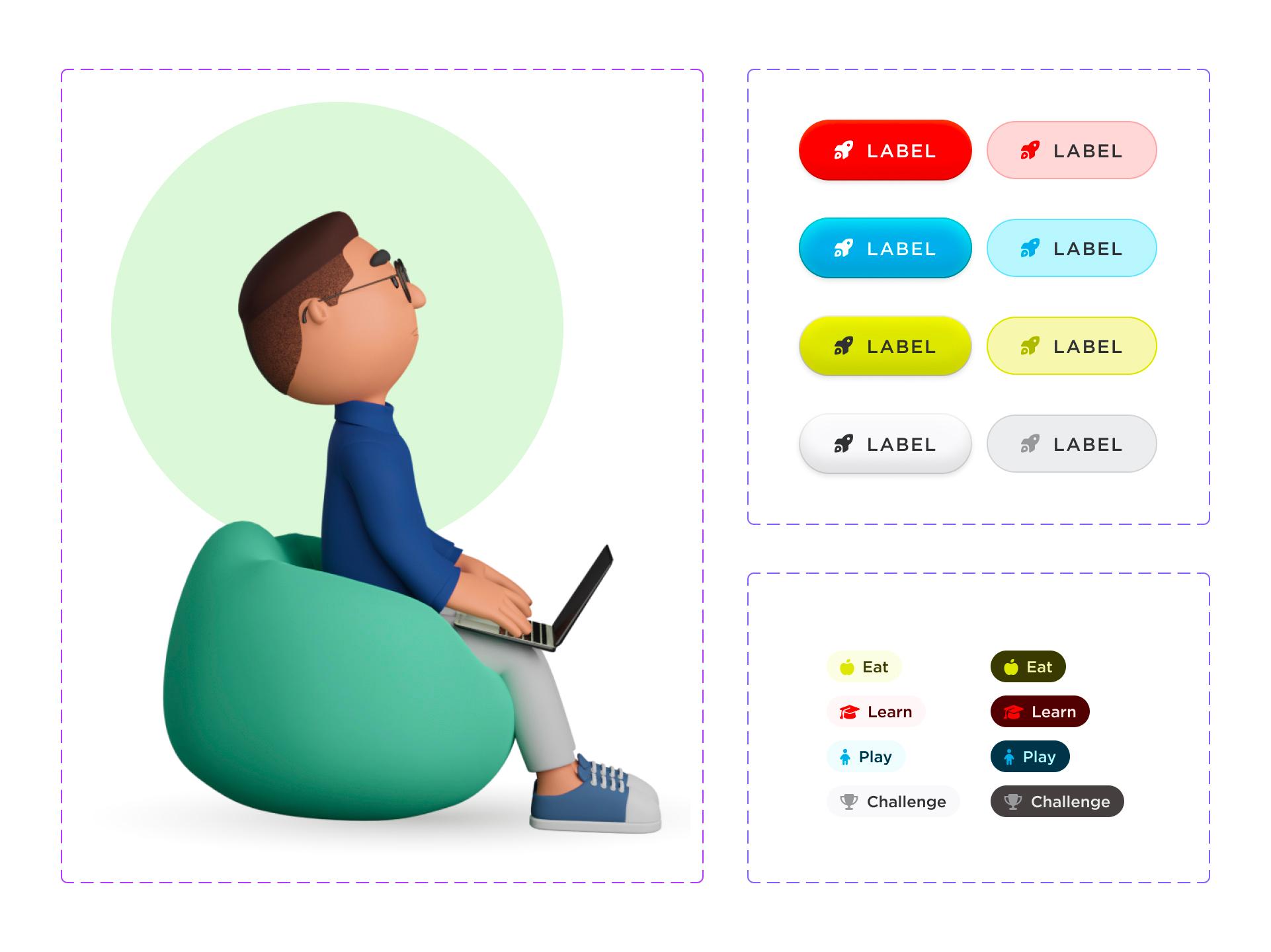
Monogram revamped the KidsFit platform by integrating elements from the previous site design in innovative ways. The team carefully reimagined the categorization of resources, providing users with enhanced control and a more personalized experience when engaging with KidsFit content. In this harmonious dance between innovation and familiarity, Monogram has elevated the KidsFit experience, ensuring a vibrant and tailored journey for every user.
Technological Precision
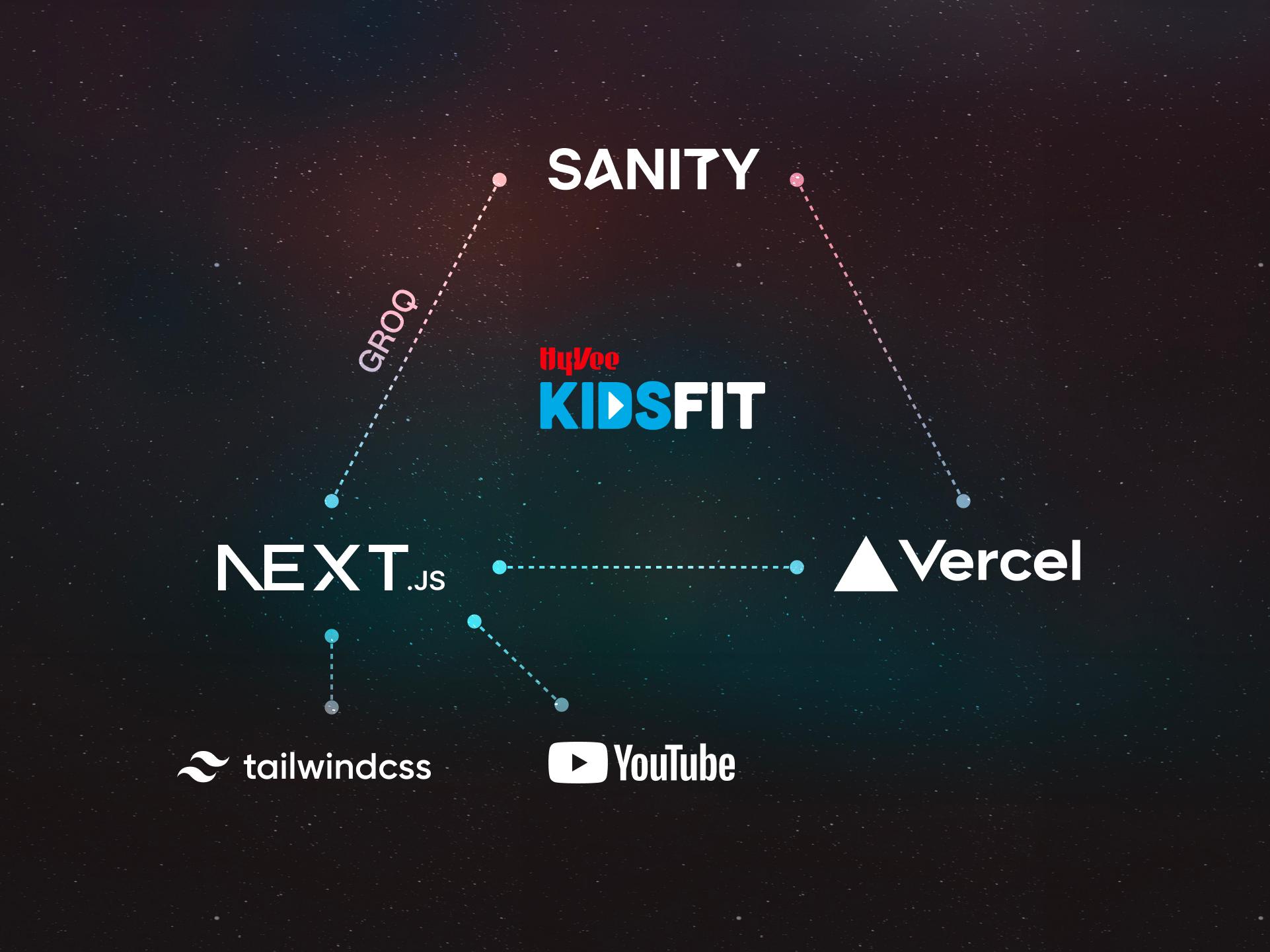
The transformation of the KidsFit site was driven by a cutting-edge tech stack, featuring Sanity for it’s content management system, Next.js for dynamic web development, Tailwind CSS for sleek styling, and Vercel for seamless deployment. Harnessing Sanity's powerful query language, Groq, we developed highly dynamic resource filters that enhance the overall user interaction. Additionally, our integration with the YouTube API revolutionized content management. Now, editors can simply add a YouTube video URL within Sanity, and our system seamlessly retrieves thumbnails, titles, descriptions, and more from each video. This innovative approach not only saves time for editors, but also ensures consistency across platforms.
Synchronized Collaboration
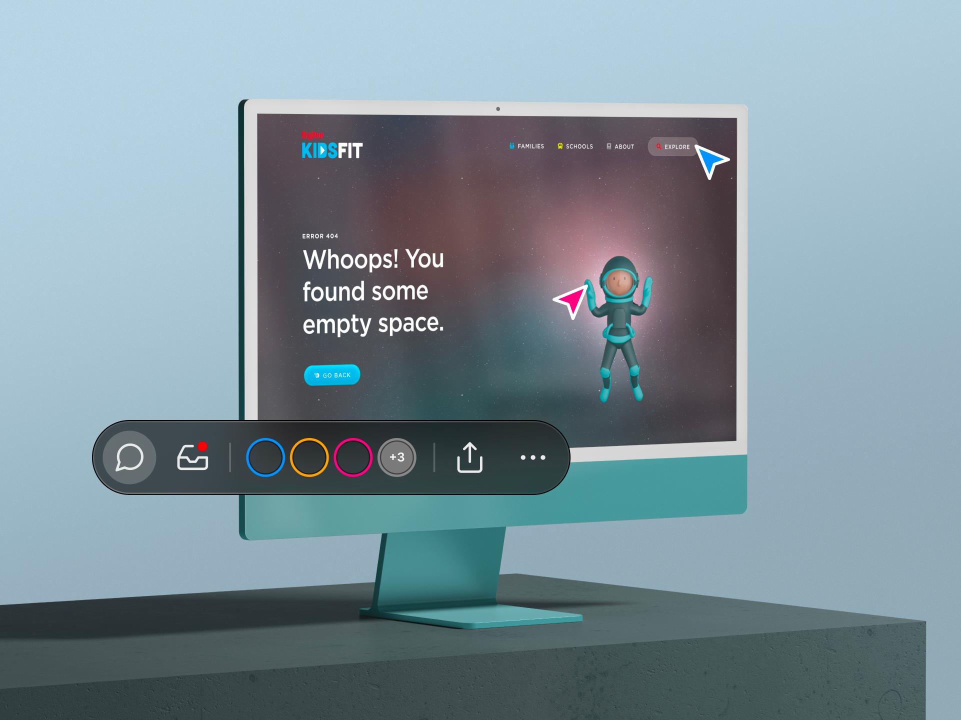
We harnessed the power of Vercel's comments to streamline interactions between teams as we approached the project's completion. Vercel's comment feature became a game-changer, providing a direct channel for feedback within the website's UI. This innovative approach ensures both developers and stakeholders are on the same page by capturing crucial context, including screen size, browser details, and operating system information. Armed with these insights, our development team initiates the debugging process with a substantial head start, minimizing confusion and accelerating the feedback cycle.
