Voyage AI
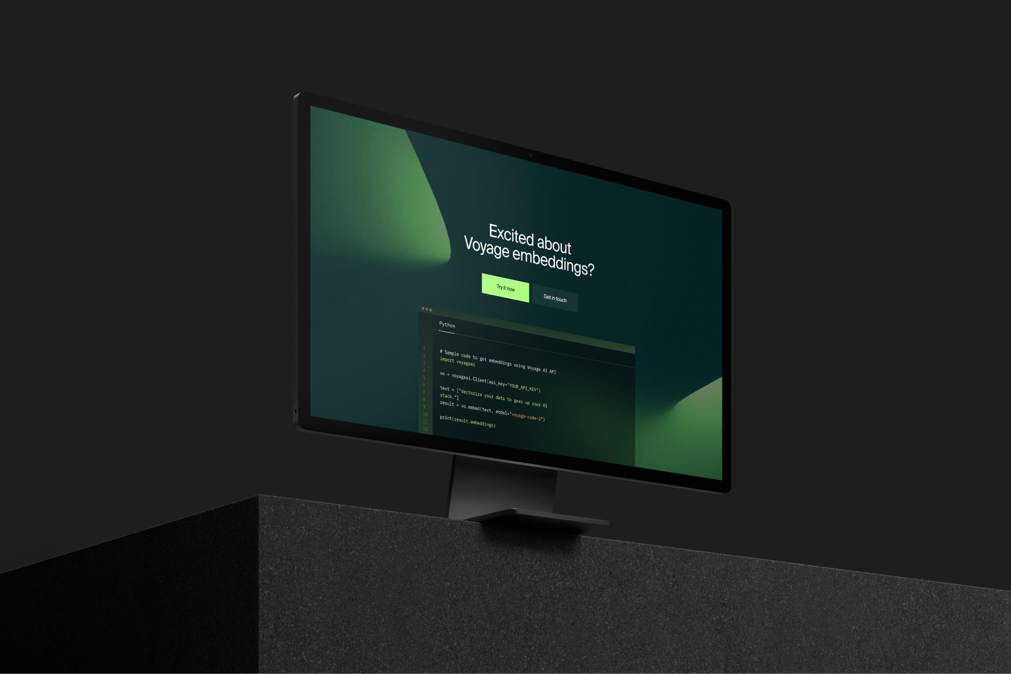
Voyage AI teamed up with Monogram to elevate their website design to new heights. While retaining the core ethos, Monogram reimagined every aspect of Voyage's website from color palette to typography, grid, illustration style and more. Monogram performed multiple exploratory iterations of designs: this case study just shares a few we loved the most.

Color Theory
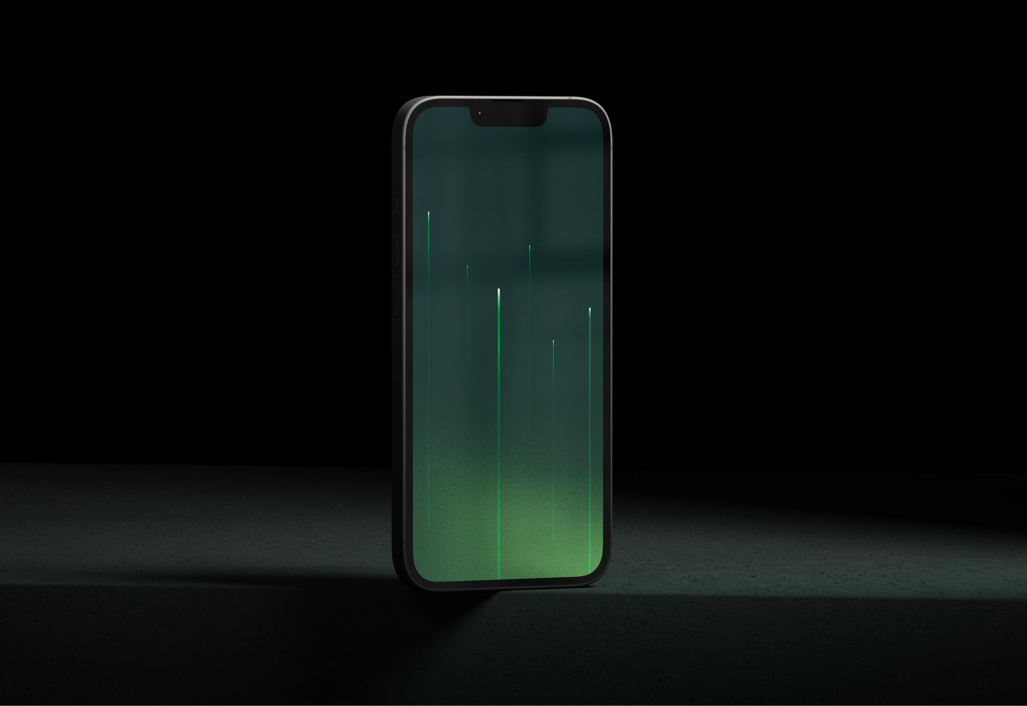
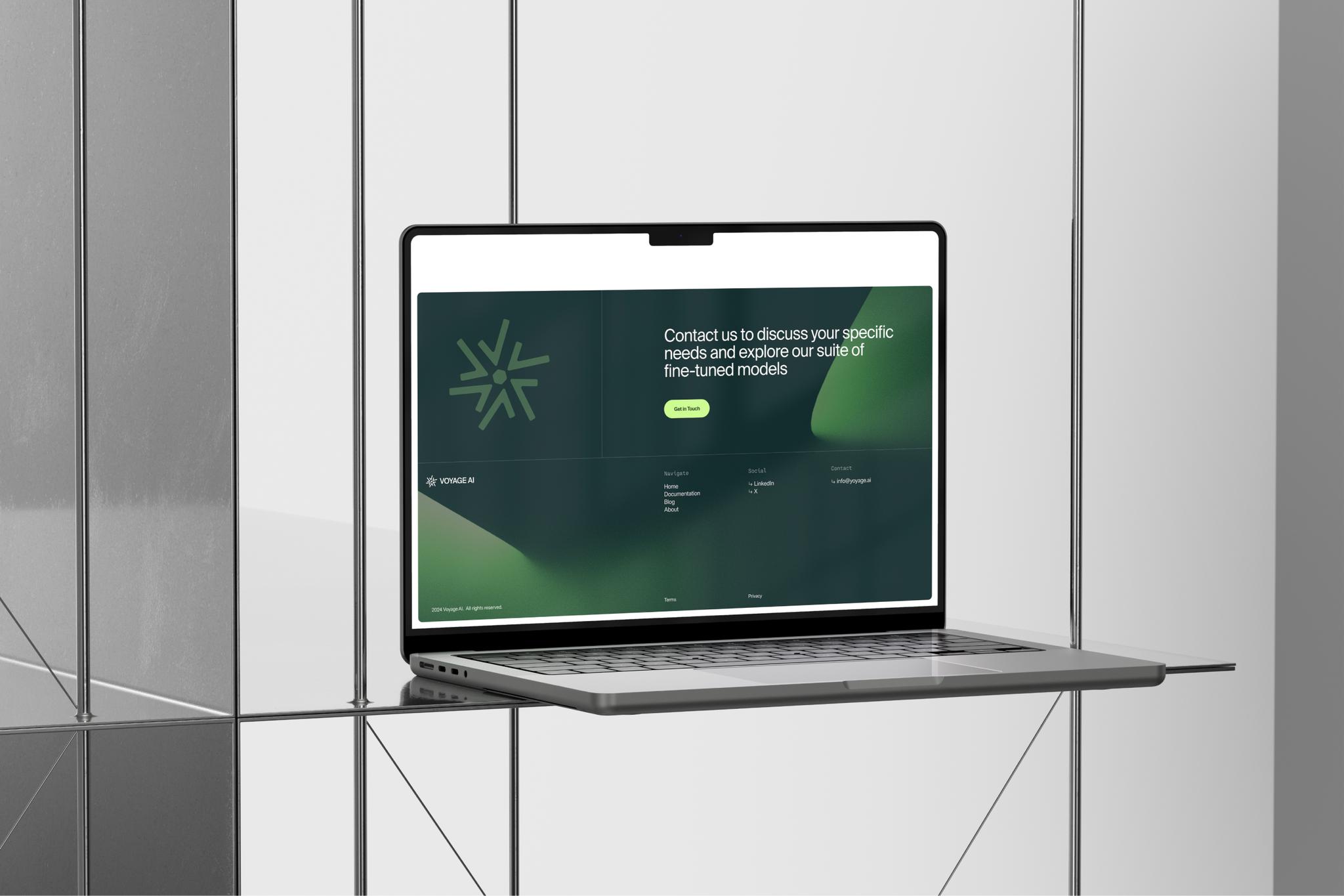
Voyage AI was meant to represent a fresh new perspective in the competitive landscape, so Monogram envisioned a foliage-inspired color scheme which felt uniquely fresh and yet professional and visually undulating.
Consistent Icon System
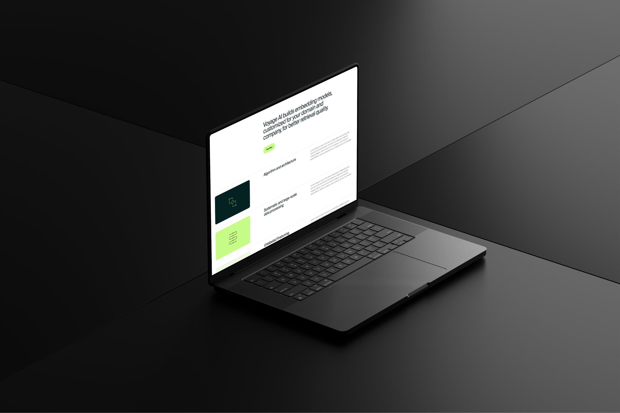
Monogram designed a consistent icon system that conformed to the rest of the design system, with consistent line weight and a holistic feel.



Refreshed Brand
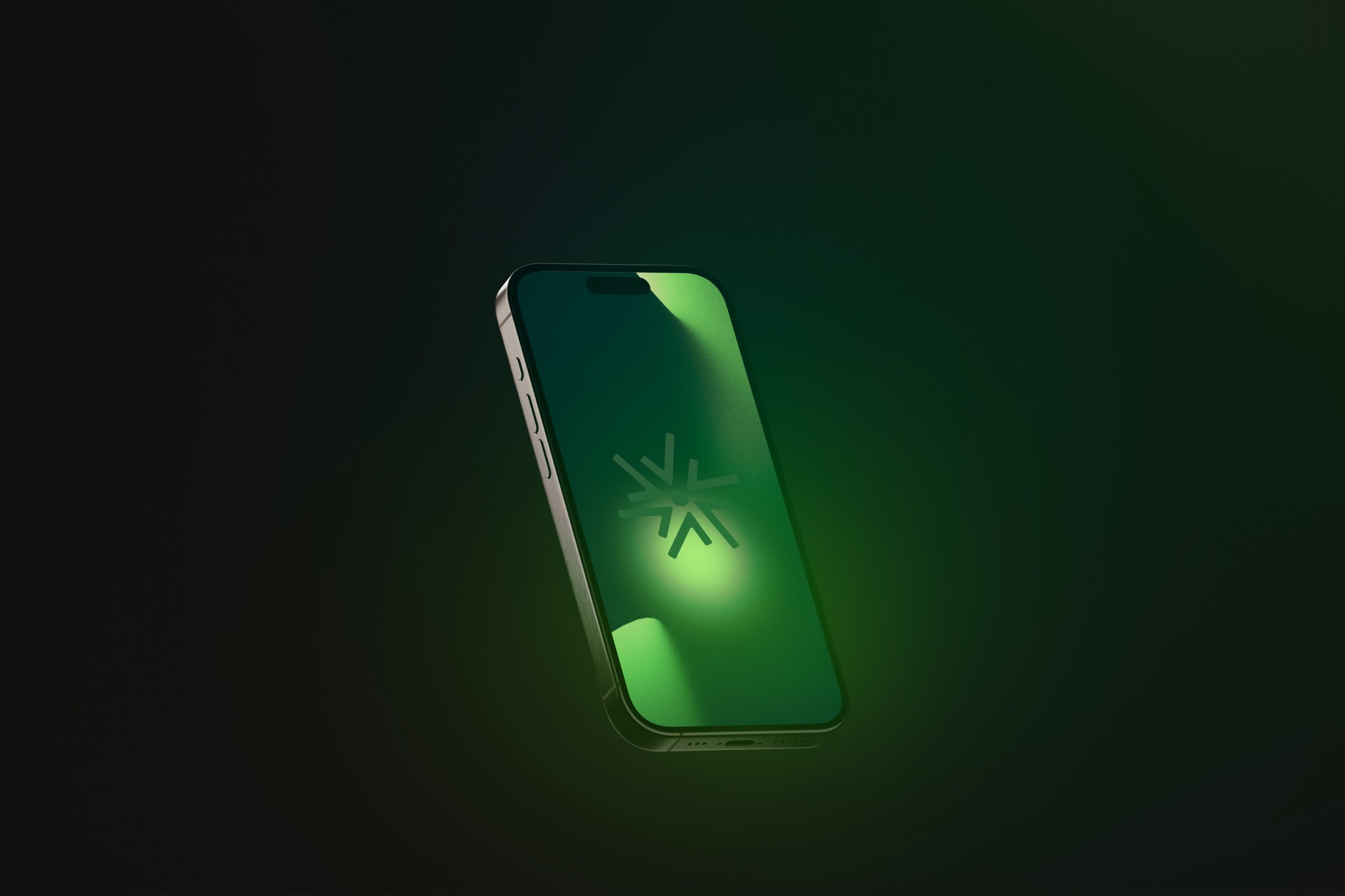
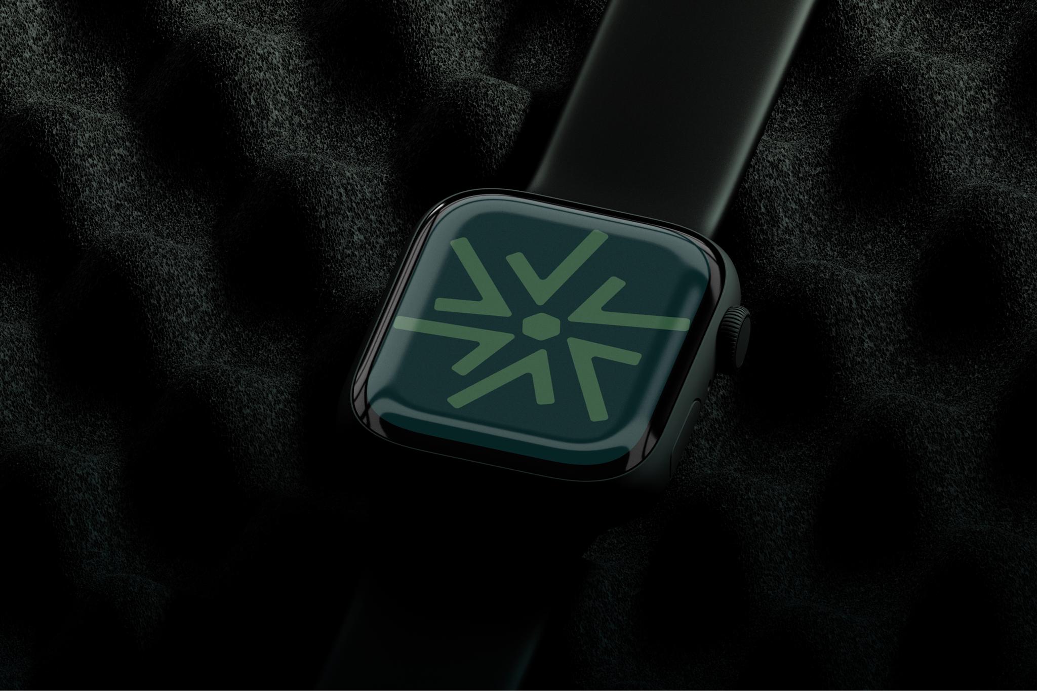
When working on the refreshed brand, Monogram wanted to retain homage to the inherent identity of Voyage while introducing a fresh logo that scales far better than the previous, watercolor-based design.
Developer-Friendly
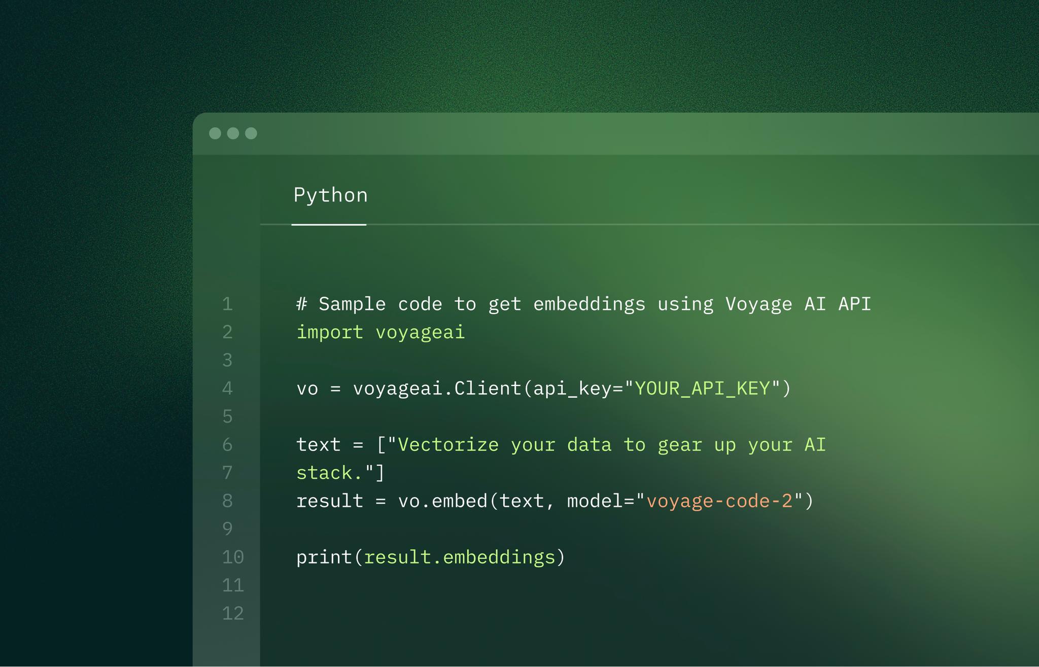
Monogram was tasked with creating a developer-friendly identity that appealed not only to enterprise clients, but grass-roots AI developers as well. Our user research proved that just the right balance of code and marketing material was crucial in getting this right.
