Tecton
Tecton is evolving to meet the growing demands of modern AI applications. As the company expands its offerings, it became essential to align its visual identity with this evolution. With this came a growing need to align the visual identity with the product vision: intelligent, reliable, and built for scale. The refresh needed to strike a careful balance—preserving brand equity while tightening up the system for clarity, consistency, and long-term growth.

Stability Meets Scale
Tecton came to us with a clear directive: evolve the brand, but don’t reinvent it. Over time, the existing visual identity had grown fragmented—applied inconsistently across teams, channels, and products. With increasing visibility in the AI space, the company needed a more cohesive brand system that could scale. The goal was to tighten up the core identity, introduce clarity, and establish a unified visual language—without sacrificing the recognition they had already built.
Signal Over Noise
We approached the refresh with an editorial mindset—curating and refining rather than overhauling. The visual foundation of Tecton’s existing brand remained intact, but we introduced structure, definition, and a cohesive system of usage. Every decision was rooted in their product ethos: turning noisy, raw data into meaningful, contextualized insight.
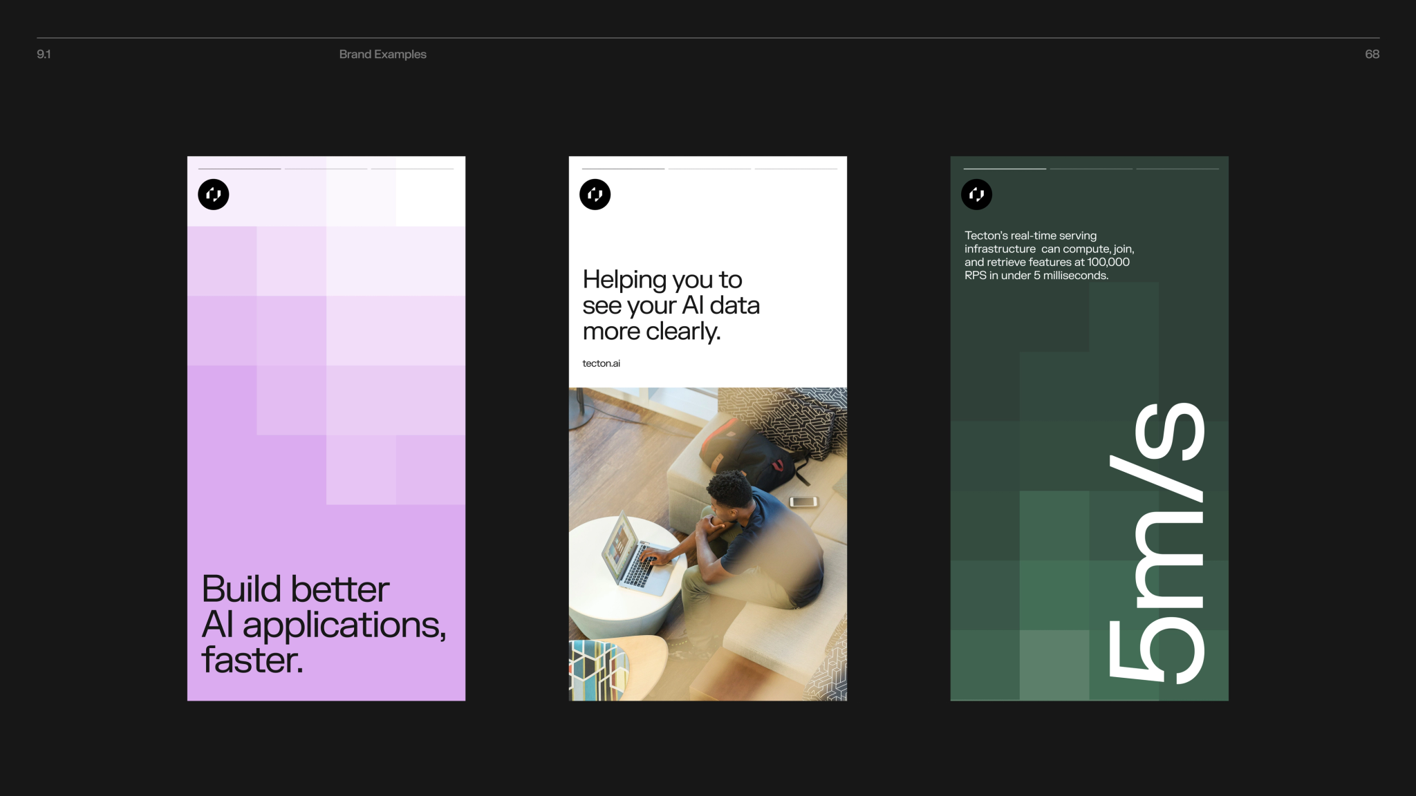
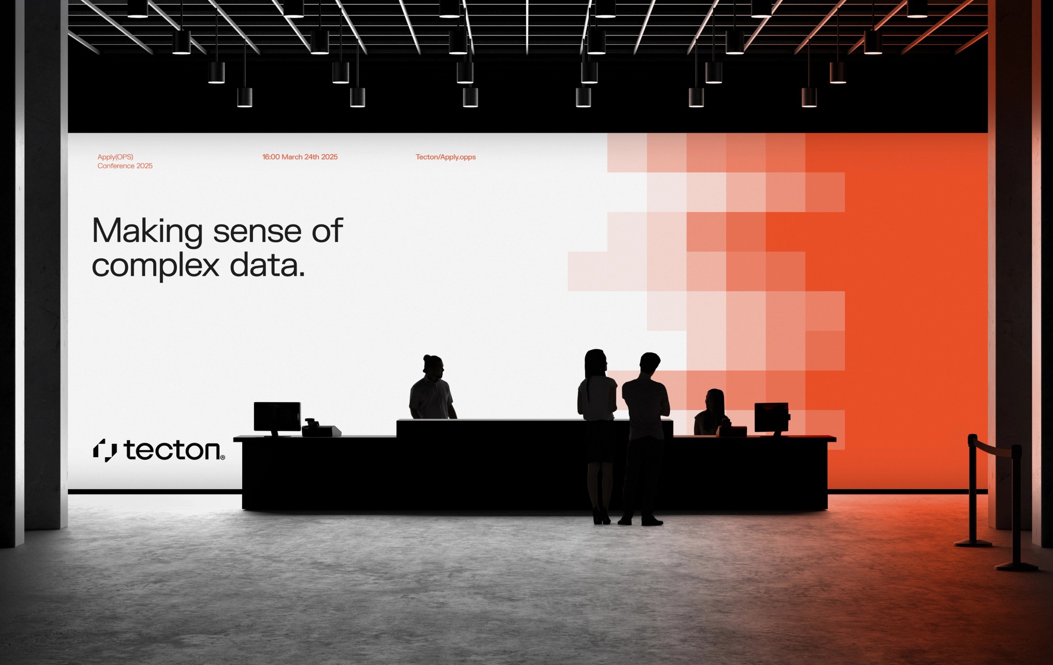
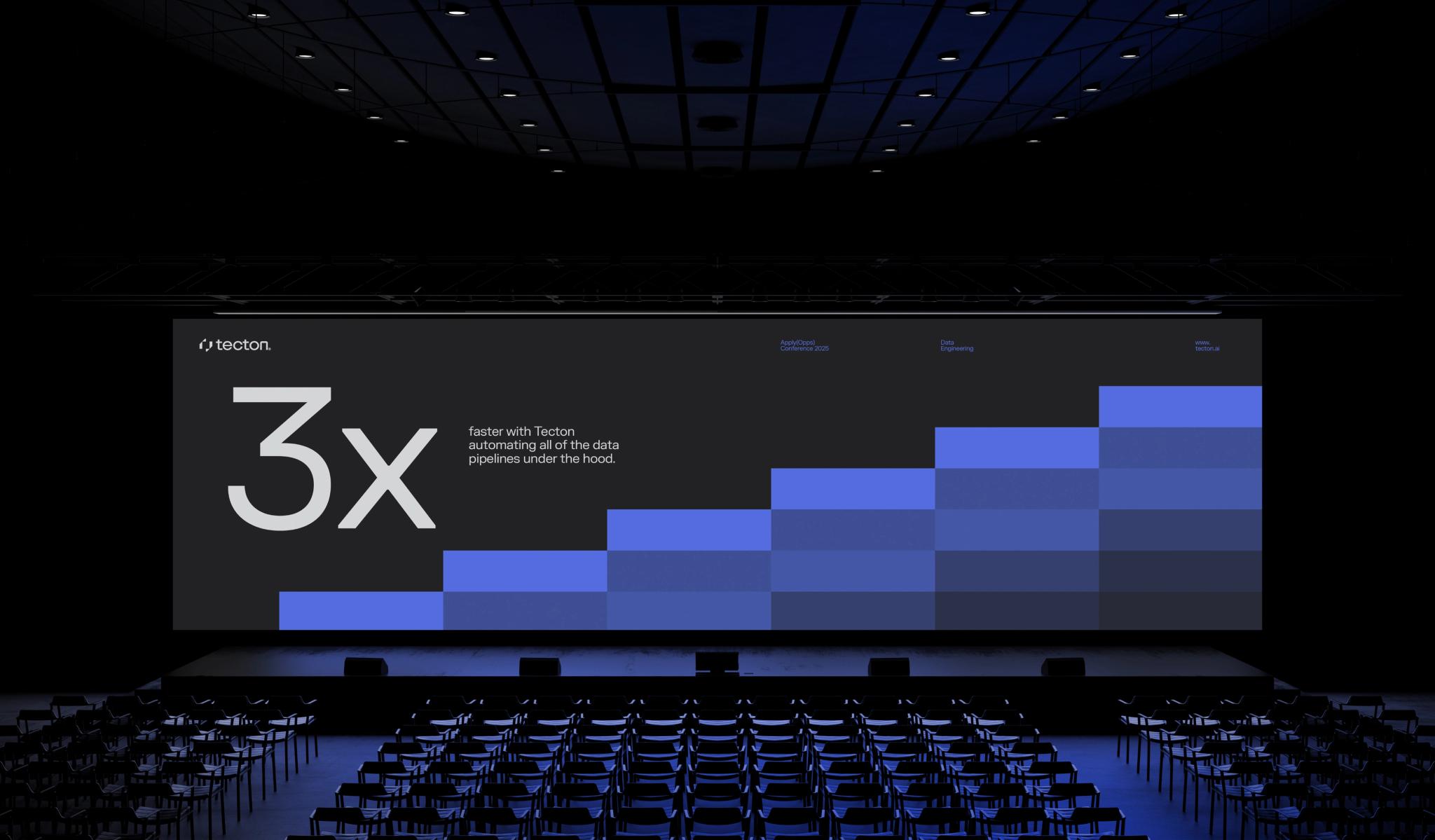
Pixel to Pattern
A new visual language emerged from this principle: abstract pixel forms organizing into structured patterns, subtle gradients suggesting signal clarity, and a restrained palette that underscored confidence without overwhelming. These elements came together to support a more intentional, scalable brand experience across product, marketing, and internal communications.
Structural Integrity
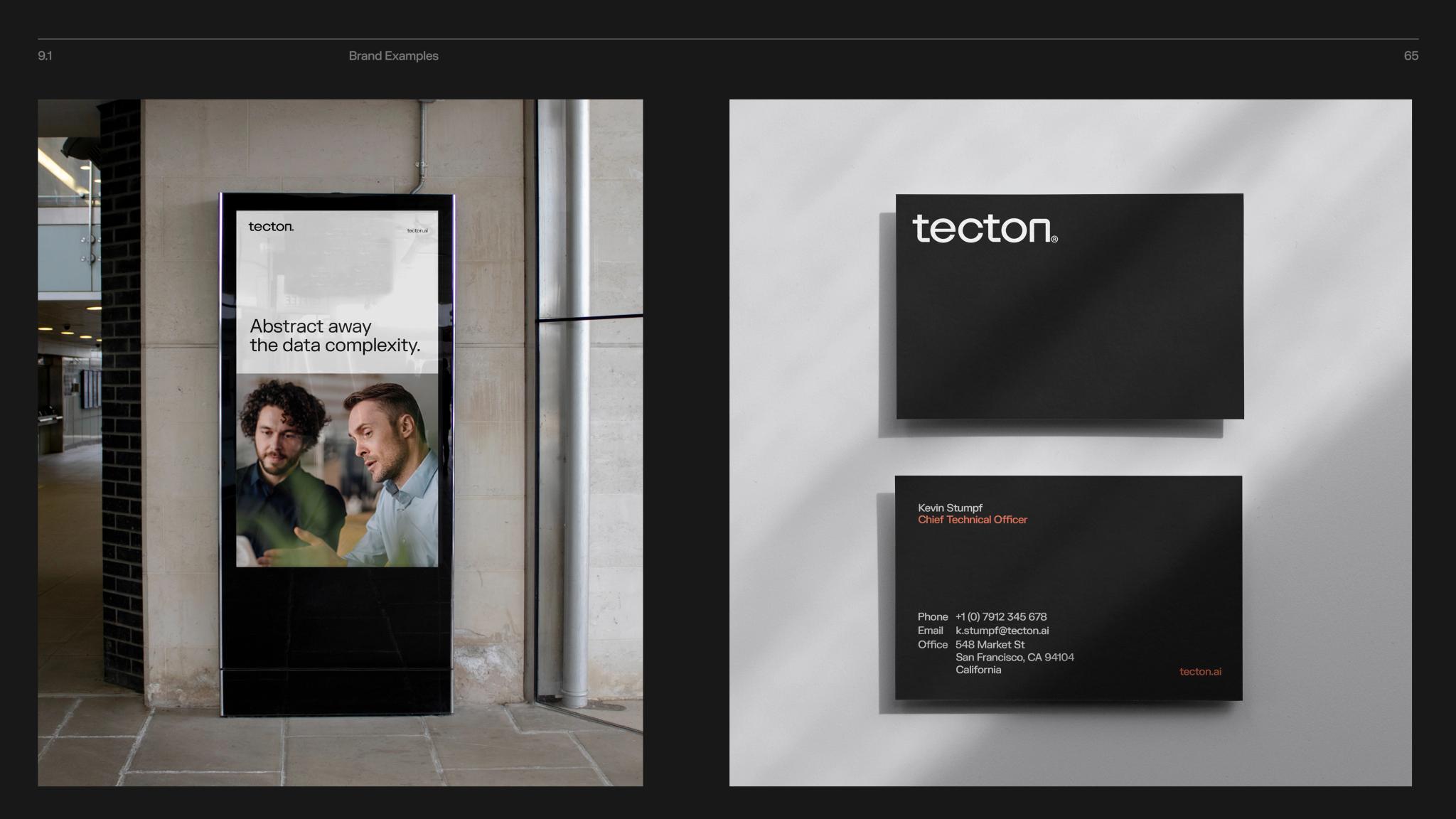
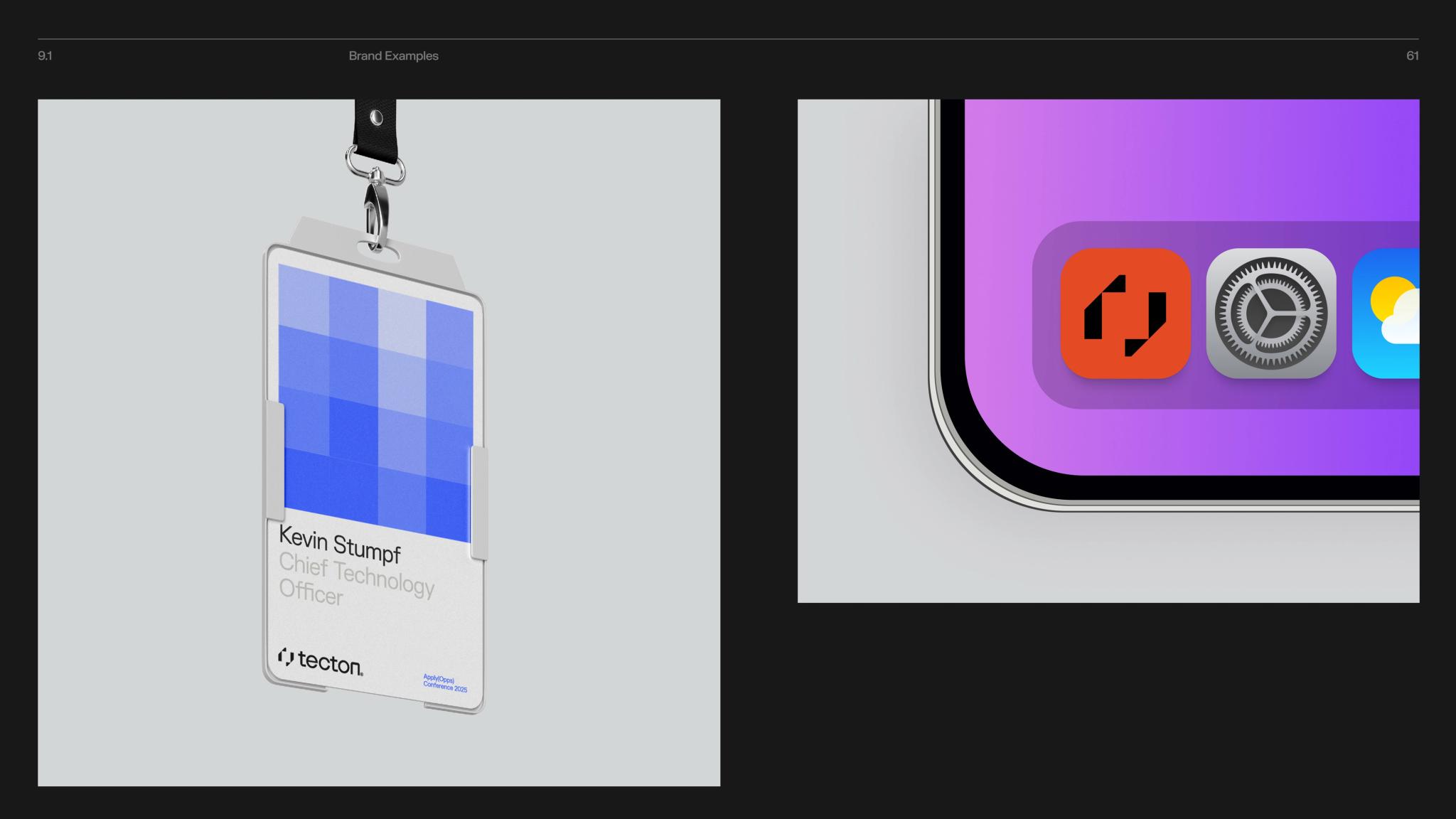
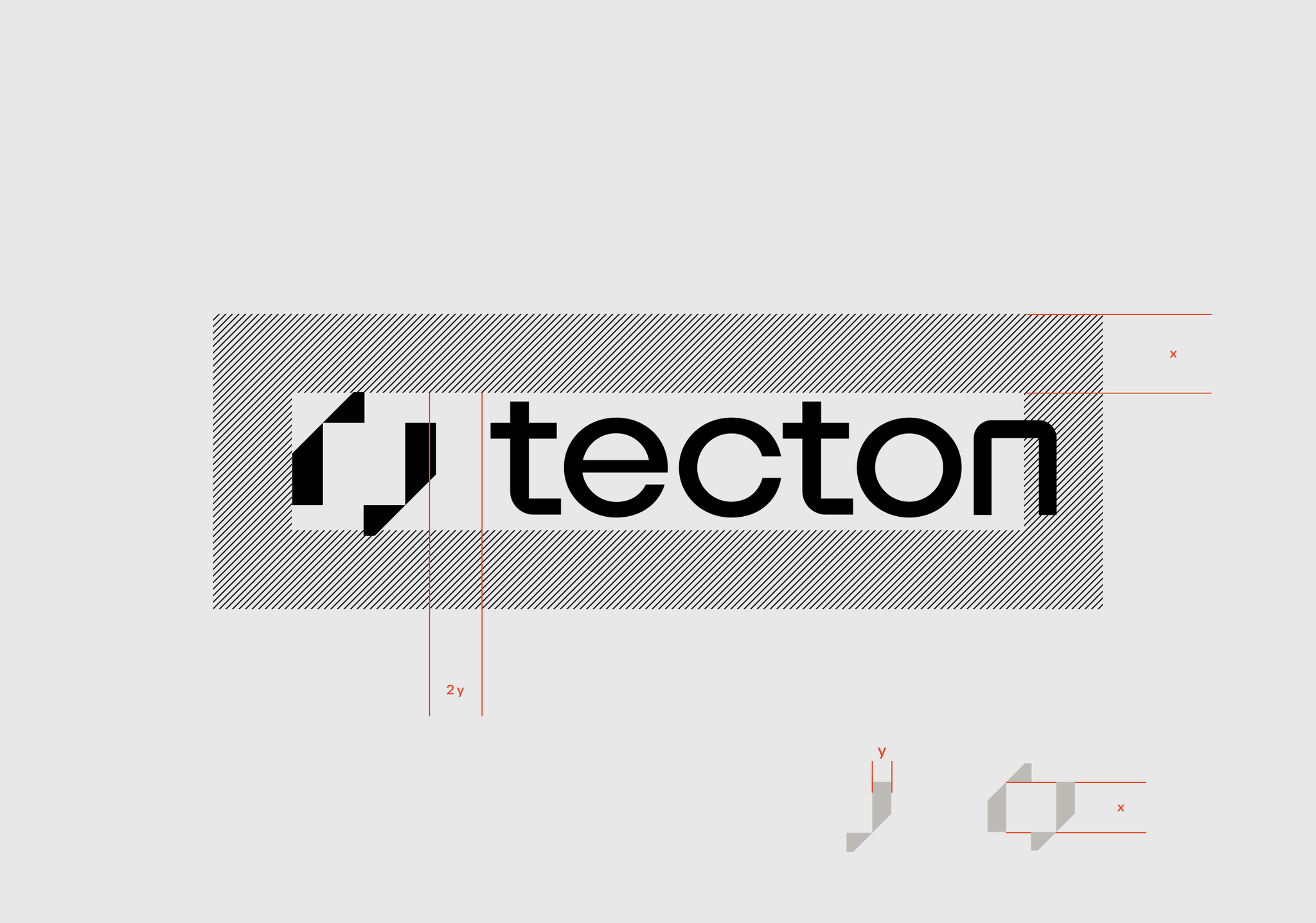
We refined the core logo, introducing clear rules for spacing, alignment, and lockups to ensure consistency across teams and platforms. The color palette was updated for greater clarity and accessibility, fine-tuned for digital environments while preserving the original brand’s recognizability. We also established foundational principles for typography, layout, and grid—tools that would allow the internal team to build confidently and consistently moving forward.

When Data Becomes Design
We introduced a new visual language rooted in Tecton’s product narrative: turning noise into meaning. This idea came to life through abstract forms organizing into structured patterns, data-inspired compositions, and a restrained use of gradients to signal clarity and transformation. The result is a visual identity that feels both intelligent and intentional—one that elevates Tecton’s presence without straying from its roots.
Recognizable, Refined
With a refreshed identity system in place, Tecton is equipped to scale its brand with confidence. The new system brings clarity and cohesion while honoring the company’s roots—allowing every new expression of the brand to feel intentional, recognizable, and unmistakably Tecton.