Metadata
Sector
- Developer Tooling
- AI
Scope
- UI/UX Design
Jetify
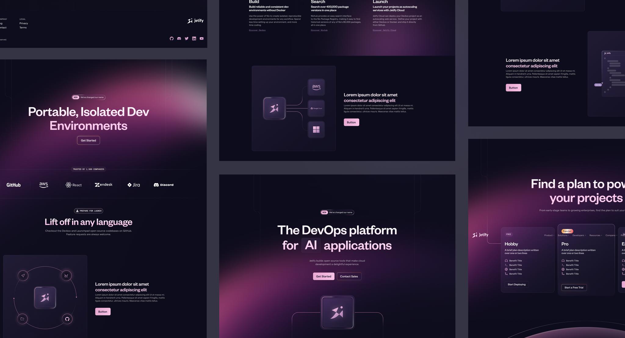
Jetify (formerly known as Jetpack) partnered with Monogram to take the design of their website to the next level. This includes taking the core brand logo, but reimagining everything else around it, including patterns, colors, typography, layout, grid systems and more.
Needless to say, the new Jetify website design is more modern, fresh, approachable, and serious while still retaining fun touches and motion.
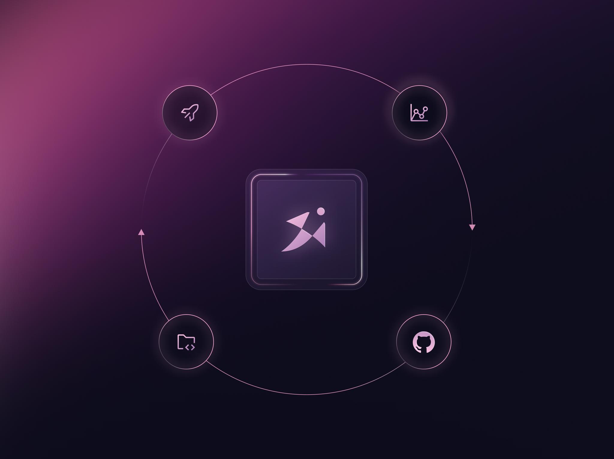
Lifecycle Illustrations
Jetify as a product depends and weaves in and out of product and development lifecycles. We felt this was a recurring theme throughout the user journey, so we took care to design illustrations that were cyclical in nature, showing that in true development workflow, there is no start or end.
Gestalt Principle
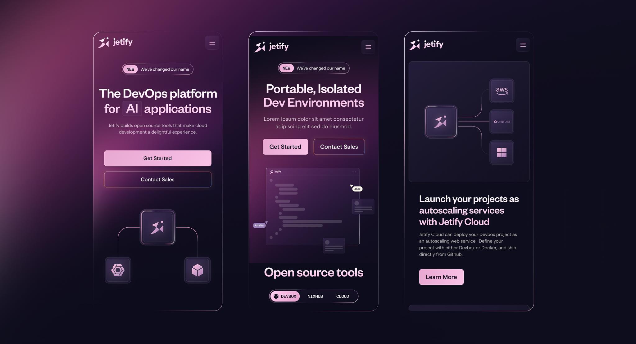
Merriam-Webster defines Gestalt as "something that is made of many parts and yet is somehow more than or different from the combination of its parts" — which is what Monogram aimed to achieve with this design. Despite designing 100+ separate components, the goal was for them all to have visual cohesion and to "work well together" no matter how they are placed on a layout.
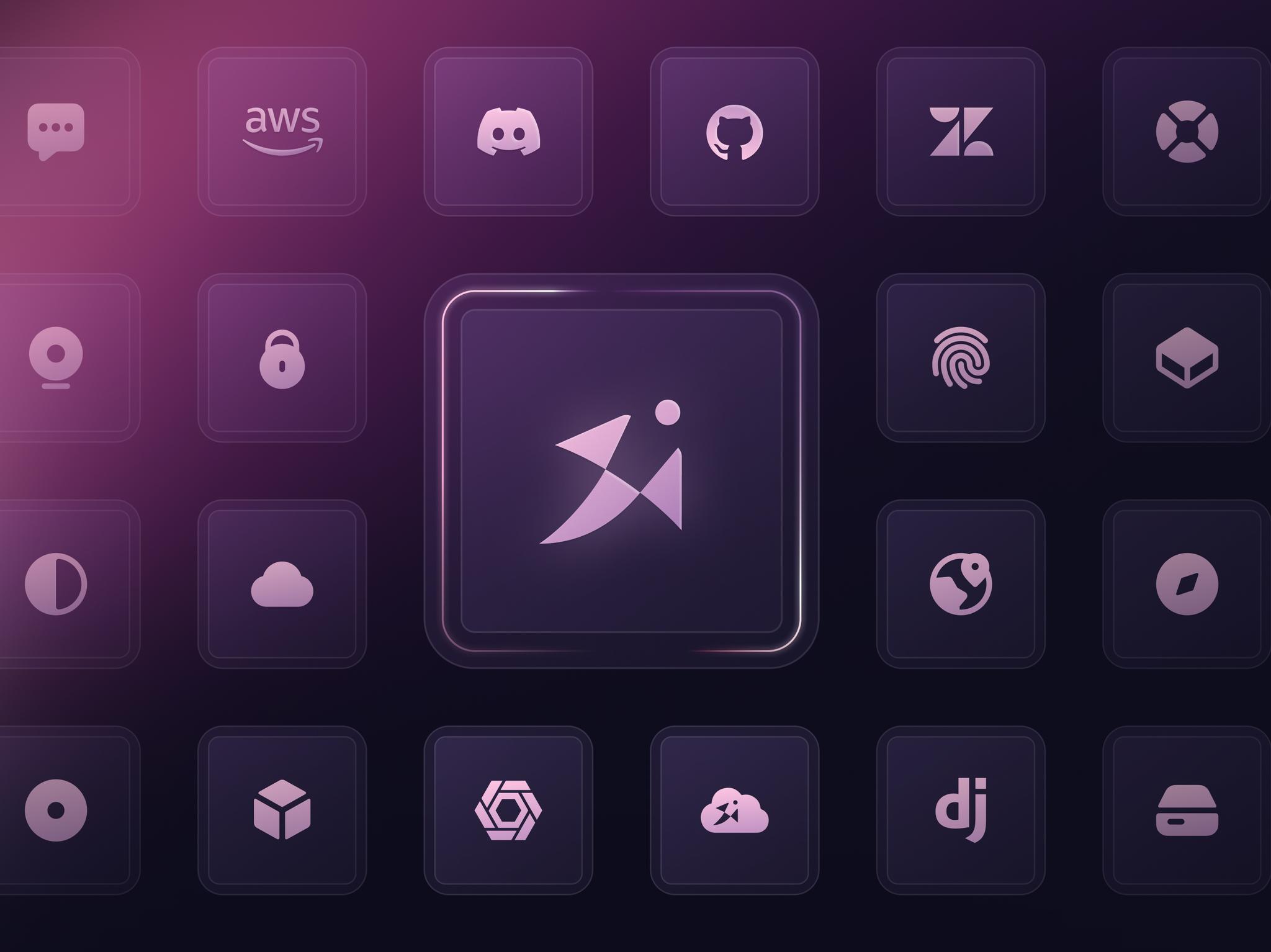
Work well with others
Jetify, by nature, is a brand and a product that must work well with hundreds of third-party apps and services. This means that the brand and identity design need not stray too far from the visual "middle" of the ecosystem, so Monogram designed a cohesive yet flexible visual language around how to incorporate other logos alongside each other.
Color hierarchy
Monogram carefully chose an analogous color palette to keep visual distraction to a minimum, while still retaining enough flexibility to use color to highlight and draw attention to areas which needed greater visibility. We used this through a series of shines, glows, and even solid color shifts. This seamlessly guides the user's eyes and gently nudges attention where it is intended to be, while simultaneously preventing any visual obstacles from distracting away from the flow of content.
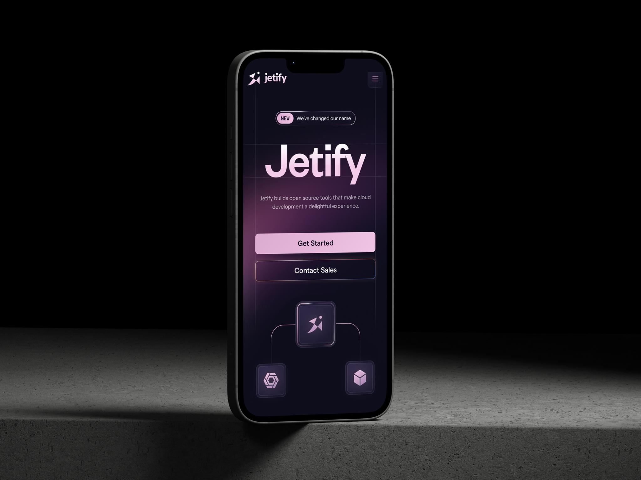
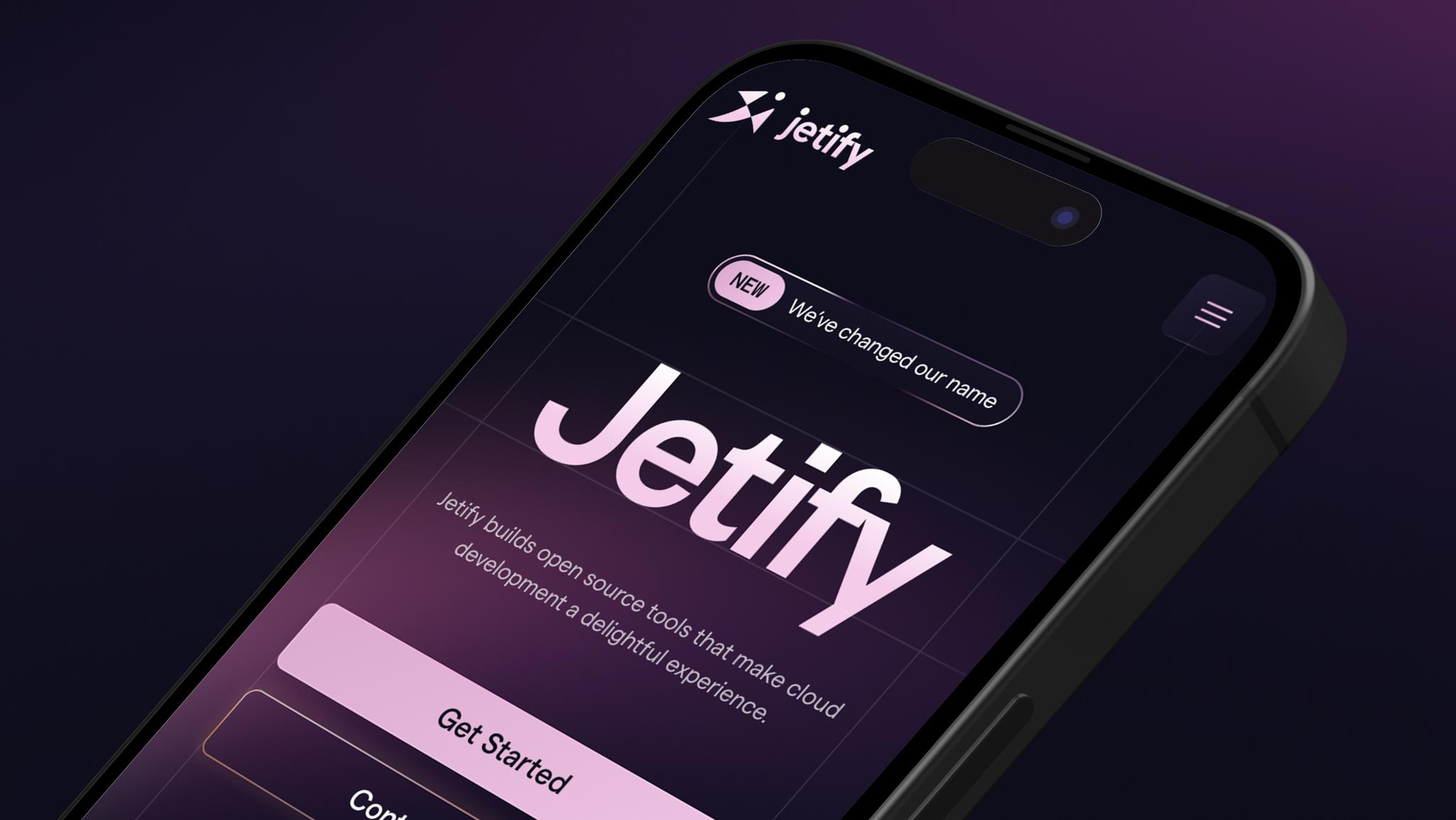
Mobile-second to none
Despite the target audience being primarily desktop users, we've made sure mobile users receive a first-class experience as well. Every element was intentionally adjusted and optimized to provide a seamless experience for users, focusing on ease of navigation, readability, and overall functionality. In doing so, we maintained consistency across devices while tailoring the user experience to meet the specific demands of each platform.